Bold
Colour comes last — even though everyone talks about it first
When I talk to my clients about their new logo, their visions and ideas, they usually get to the topic of colour very quickly. Colour often seems more important than form. I could keep this article very short: that’s not true. In visual perception, we grasp shapes and contrasts much faster than we grasp colours. This is due to the physical structure of the human eye — and I’ll spare everyone the details of rods and cones, since we inhaled enough of that in biology class.
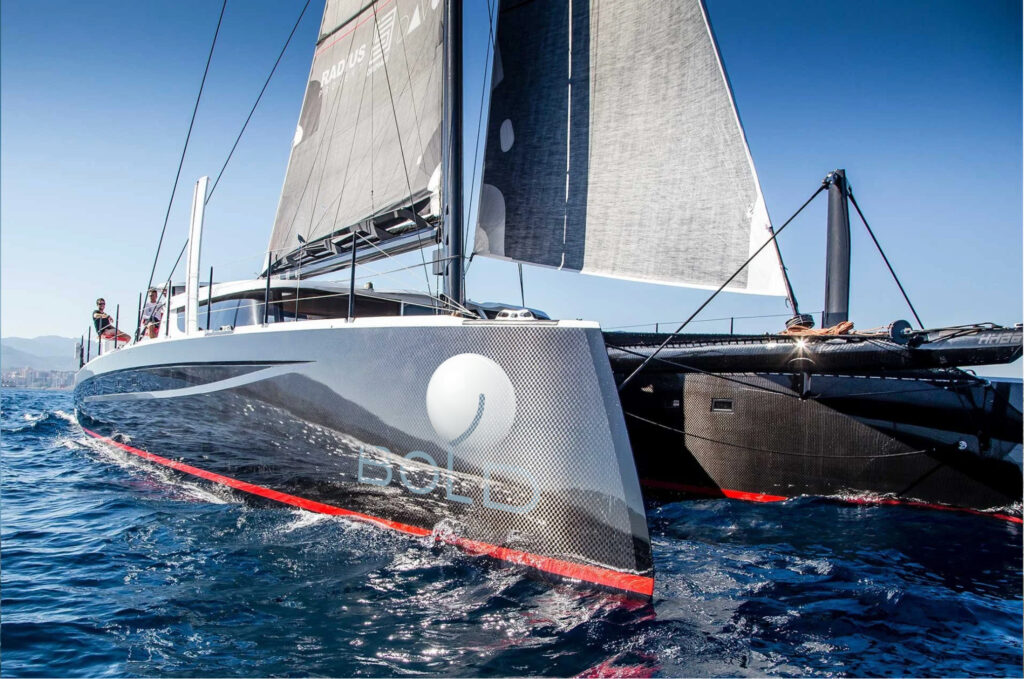
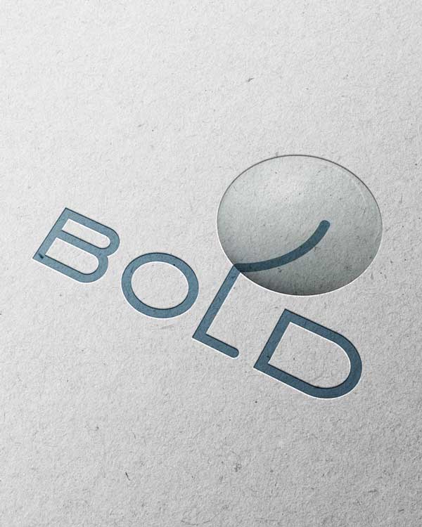
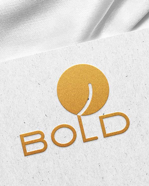
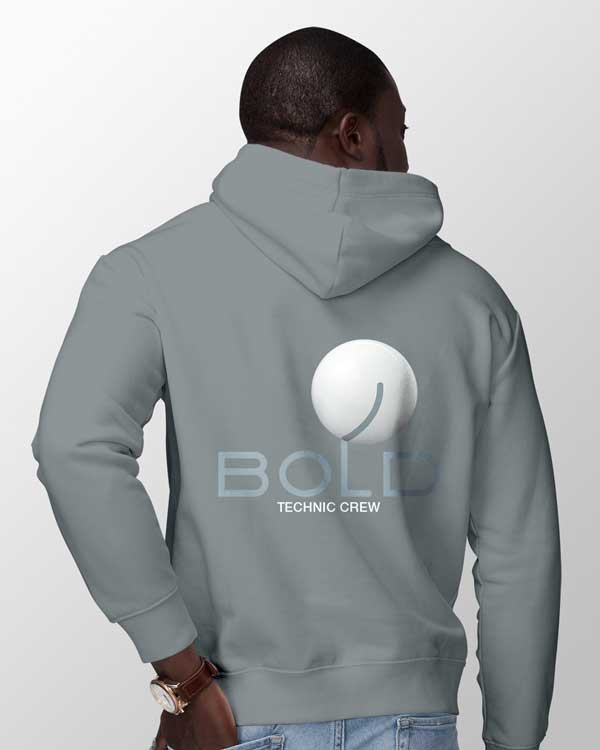
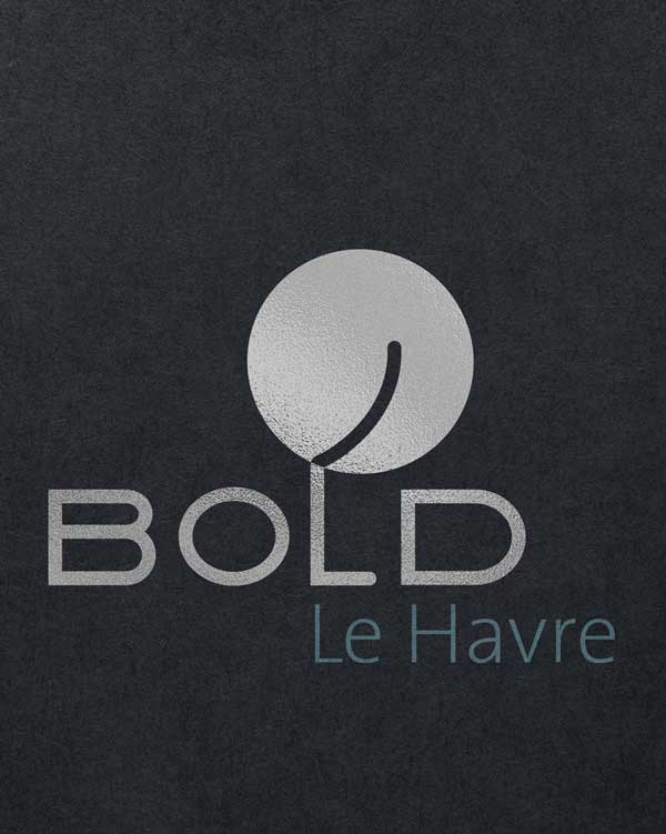
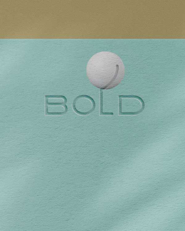
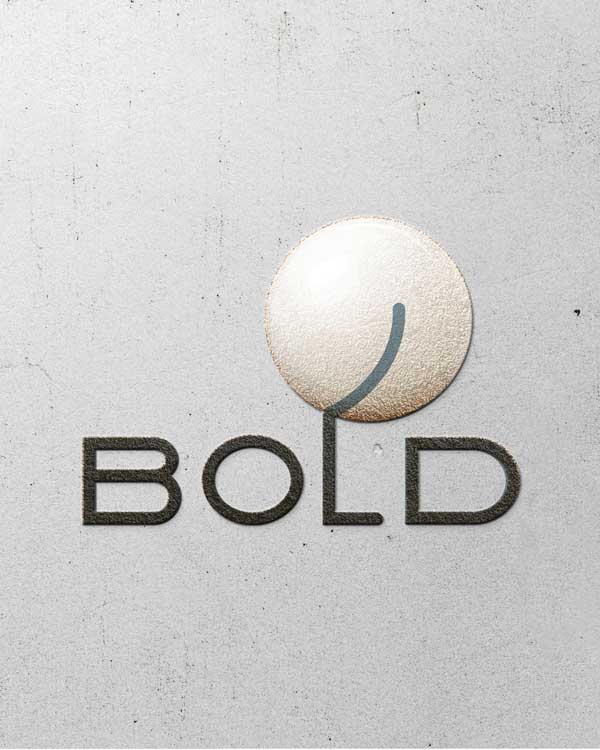
With Bold, I had the pleasure of being flexible with the colours. Sometimes the logo appears white on a black background, sometimes grey on sand, sometimes black on metallic. The great advantage lies in being able to adapt the logo precisely to the material it will appear on. We don’t have to produce black shirts just because the logo comes in a light colour.
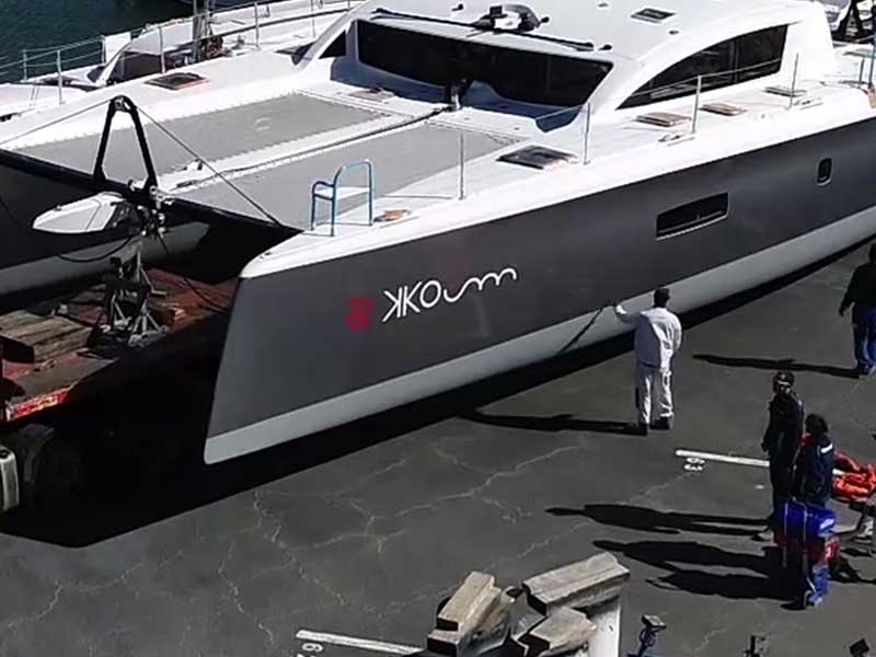
The hull always plays a major role, too. I remember creating a logo in red and grey for the yacht KKOUM — and unfortunately the hull came out of the shipyard much darker than intended, which made the beautiful red Asian element of the logo very hard to read. We ended up adjusting the colours after the fact.
That won’t happen with Bold. The logo has such independence and such strong recognition value that it could appear in any colour.
Besides, I still believe that recognition is not necessarily the primary goal for yacht logos. (Charter companies are, of course, the exception — after all, you want to sell the yacht experience, not just enjoy it.)
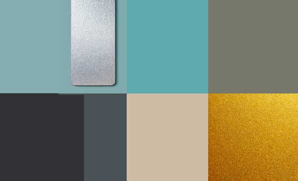
So we created a small moodboard with seven colours that form a certain harmony when they appear together — while remaining completely free in the choice of each individual colour. And if my client’s general taste ever shifts from elegant to poppy — red, orange, pink and blue all work beautifully, too.
Thank you for your trust, and I can’t wait to see this beauty in the water.