Samples for YACHT LOGO DESIGN AND BRANDING
For whom is it made for?
Owner of sailing and motor vessels
shipyards
yachtclubs
Superyacht Owner
Yachting Industry
Sailing Sponsors
Have a little insight in our Samples.
We offer our services to every Yacht Owner with a preference for individuality and style. Each vessel represents an own character as well as the owner does. If you like to make your vessel and its equipment unique you should get in touch with us. We will make it happen, in the right way. So please feel welcome at our yacht logo design and branding service.
SISU
In the sailing community, they are known far and wide.
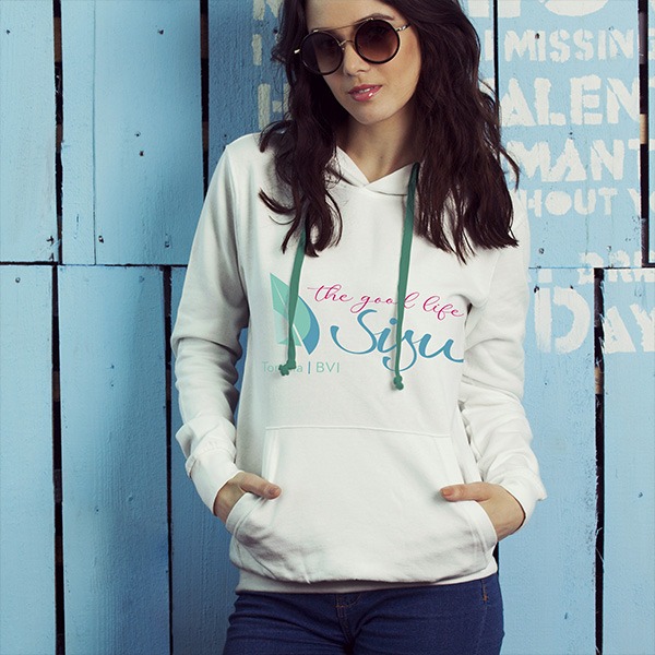
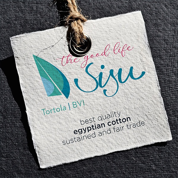
The Sisu’s. Petro and Frik set sail from South Africa in 2019. The two of them have done almost everything on the boat themselves: the refit, a perfect interior, top-notch equipment, and even the logo. However, the logo wasn’t quite as perfect. The more famous they became, the more important the logo became. Now, the two are in the chartering business with the Sisu and have commissioned me to develop a fitting logo.
Here it is.







BLE
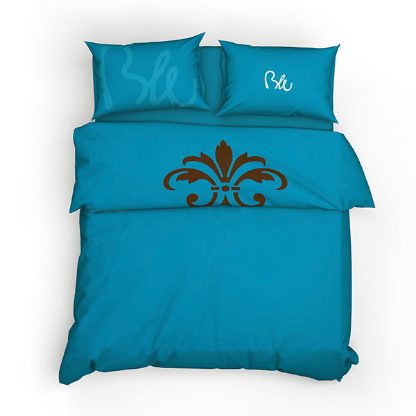
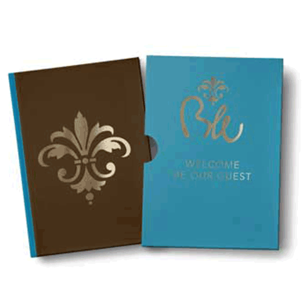
BLE will be one of the most modern and sustainable super yachts in the world. Solar and a modern waste management, light and natural based materials make BLE a perfect yacht for an environment friendly sailing era.
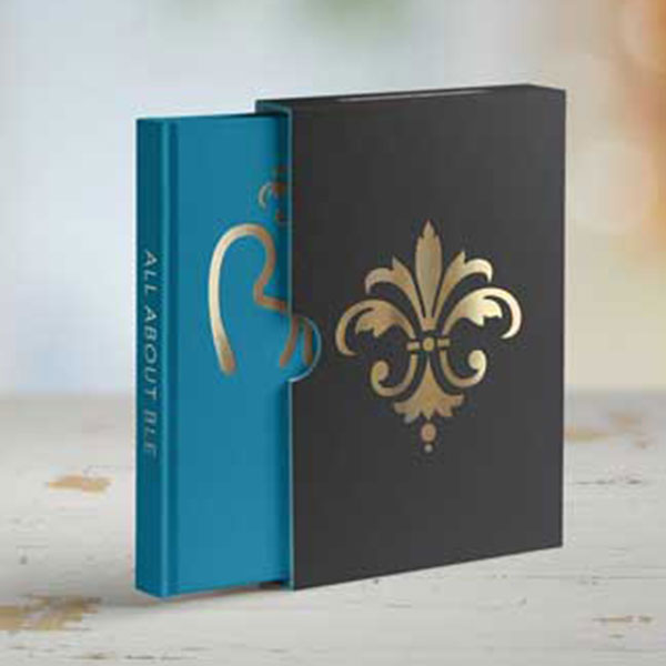
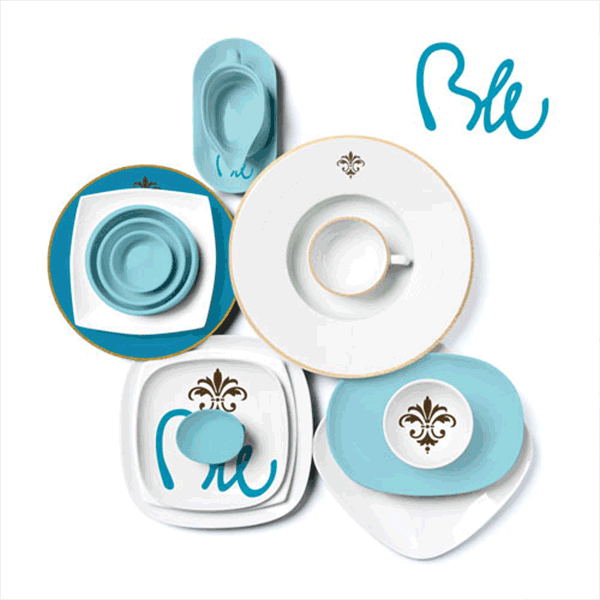
The logo design and branding are a mixture of a classical lili icon and an handwritten type which is digitalised to be used in each size.
We chooses the color turquise and gold. What is as well a mixture between tradition and state of the art.
STRUWWELPETER
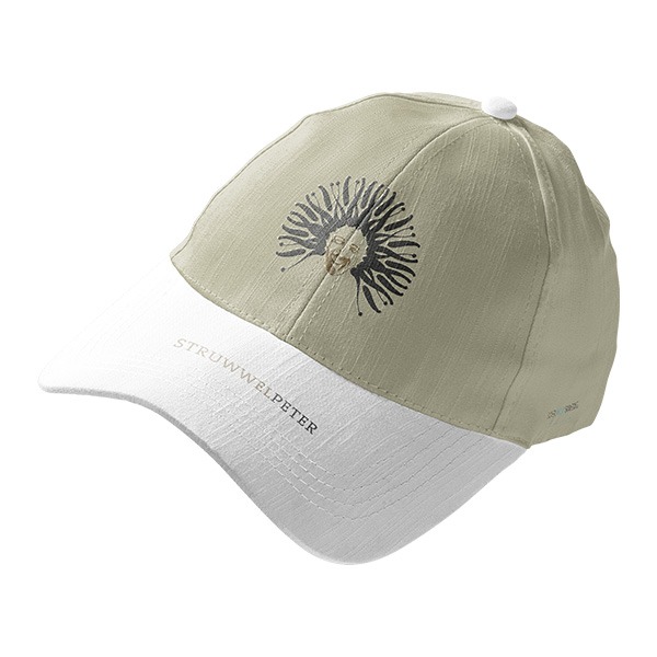
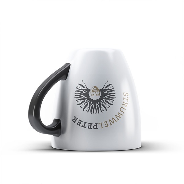
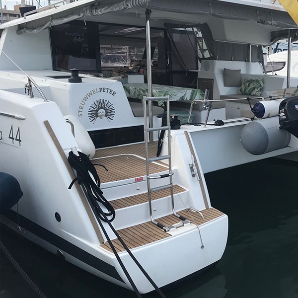
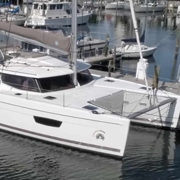
One of the most challenging tasks I’ve faced in logo development was the one set by Andy and Sissi. The name of their boat is Struwwelpeter. Long names are something I deal with often, but this one is emotionally charged on a whole other level. Struwwelpeter is a collection of cautionary tales written by Heinrich Hoffmann around 1840. Each story ends tragically—whether it’s a boy having his thumbs cut off or a little girl burning herself. Not exactly the kind of material to evoke positive vibes. So, I decided to interpret Struwwelpeter with a touch of irony and put Andy, the owner, in the spotlight.
Here’s the result.





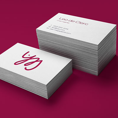
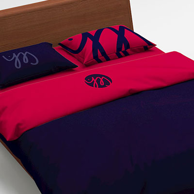
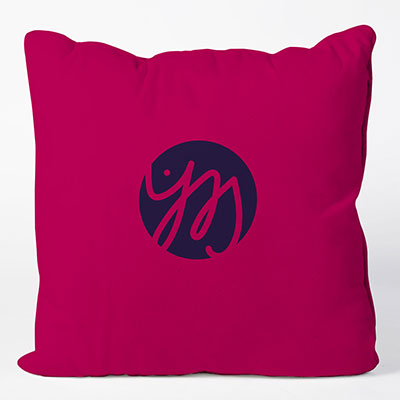
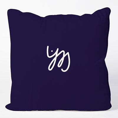
YAS
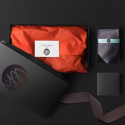
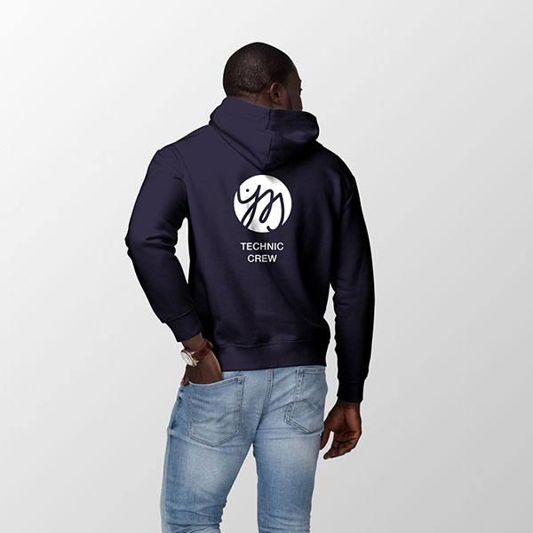
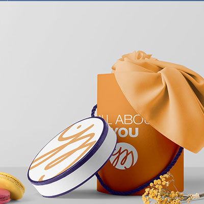
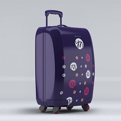
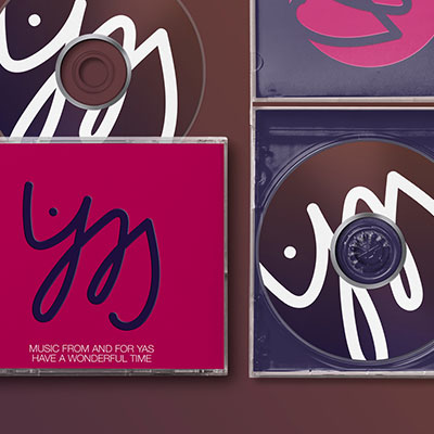
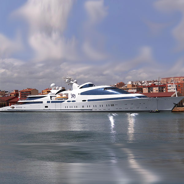
A logo and a branding for a traditional but at the same time very modern vessel.
It was a pleasure to work with a 3 letter word. The color was given.
Yas is a private superyacht rebuilt by ADM Shipyards. She was launched in 2011 and delivered in 2015. At 141 metres (463 ft) in length she is one of the largest superyarchts in the world. Named as Swift141 during development, Yas is based on the hull of a former navy frigate. HNLMS Piet Hein of the Royal Netherlands Navy was launched in 1978 and sold to the UAE Navy where she was operated under the name Al Emirat. Today she is a very special example in Superyacht history.
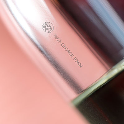
I did the redesign with a mixture of arabic and latin typedesign.



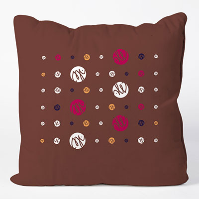
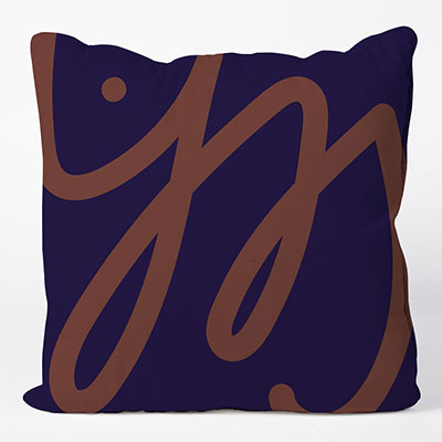
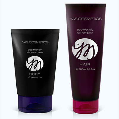
KKOUM
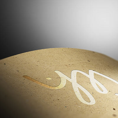
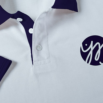
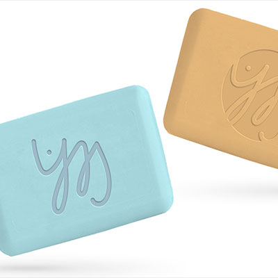
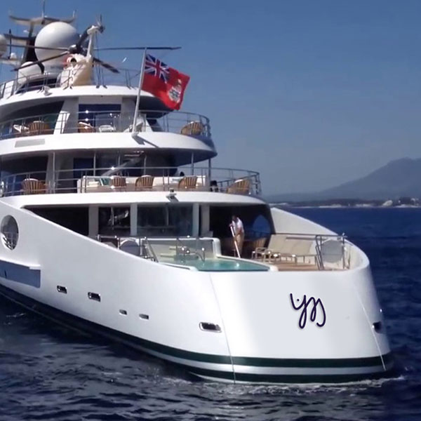
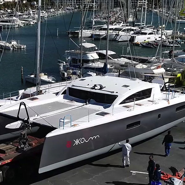
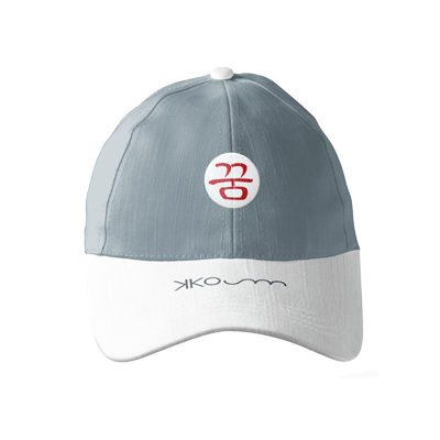
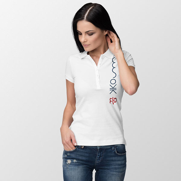
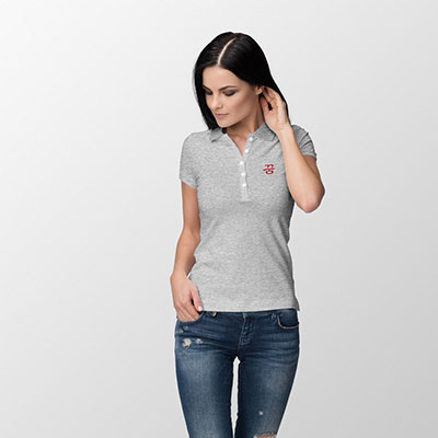
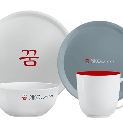
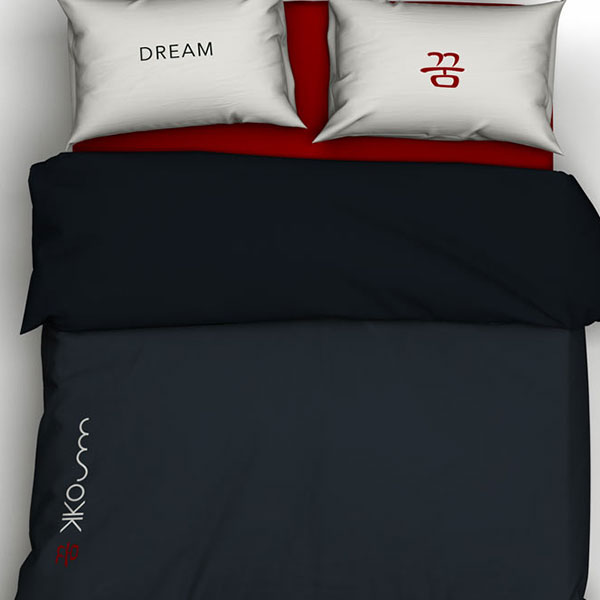
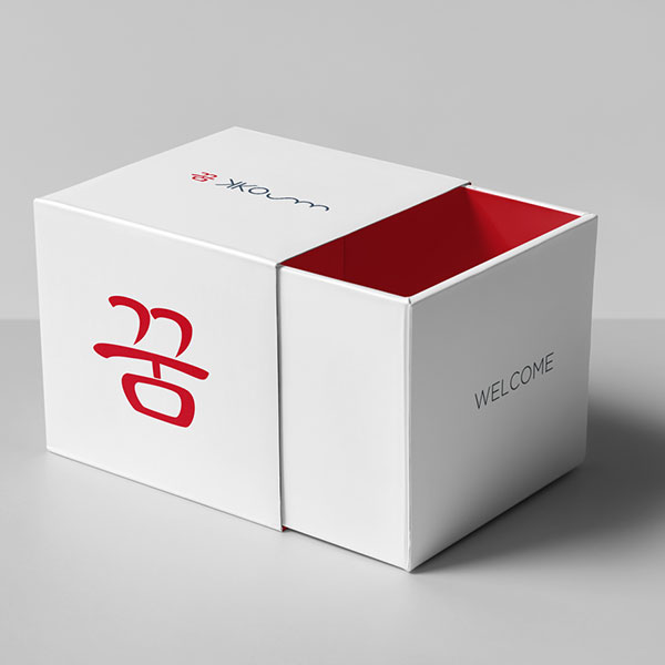
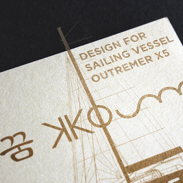
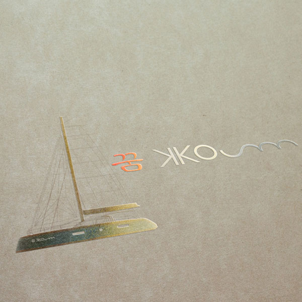
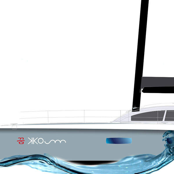
I met the owners of KKOUM while sailing an Atlantic crossing. They are wonderful people. Both very open minded with a Korean and French background. The beautiful and fast Outremer 5X sailing catamaran will be on its journey around the world soon. The logo design visualises the Korean word for dream, that’s what KKOUM means.
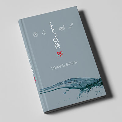
It had to be unique design and yacht branding with a combination of the Korean and Latin typeface. Both elements can be used in combination or stand alone which opens up a great variety for the design of shirts, linen, porcelain and other features. It was a pleasure to realize this project.

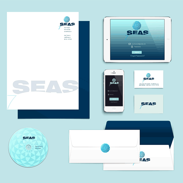
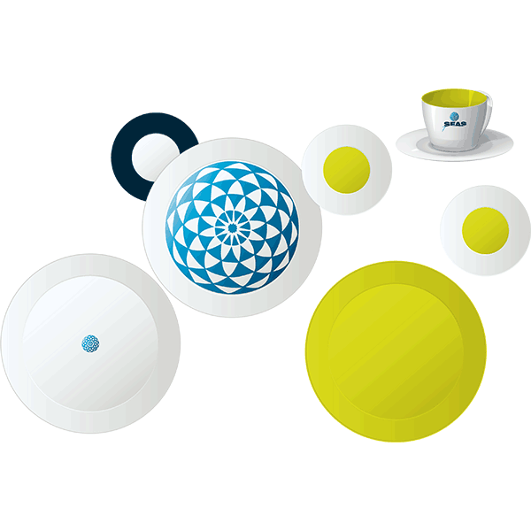
7SEAS
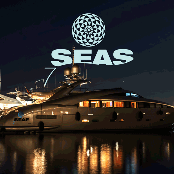
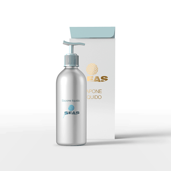
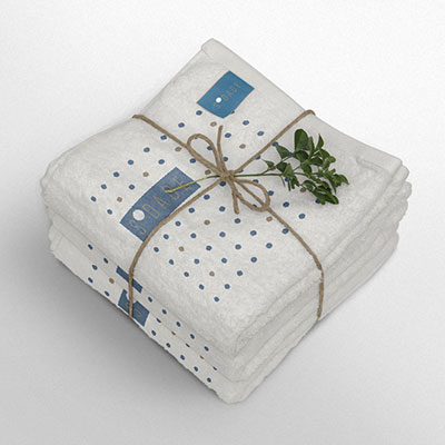
A Superyacht which is more than comfortable. It’s like to be on an other planet. Even the soap, all towels and linens are made of bio-materials.
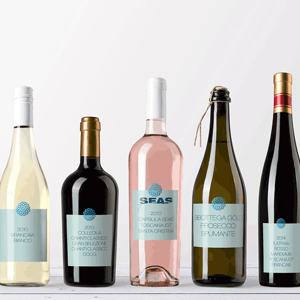
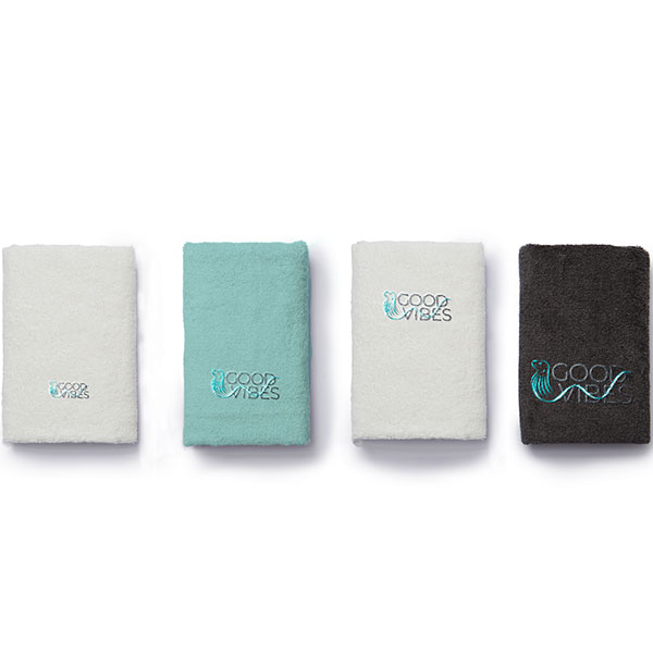
The 7seas is a 95 feet motor vessel. Finalization is expected in 2019 and she will sail under the Italian flag. My job was to design the equipment for the crew and guests. For example: own soap will be produced in Italy. Wines and prosecco are bottled specifically for the 7seas. There will be embroidered towels and branded porcelain.
Thanks to the owner family for a wonderful cooperation.



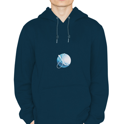
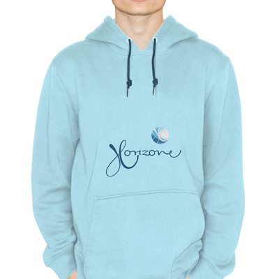
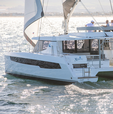
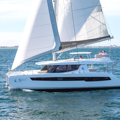
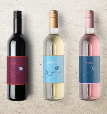
HORIZONE
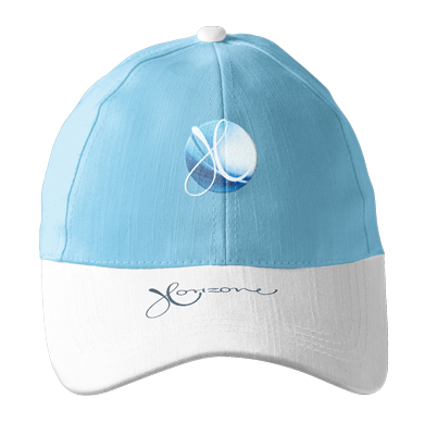
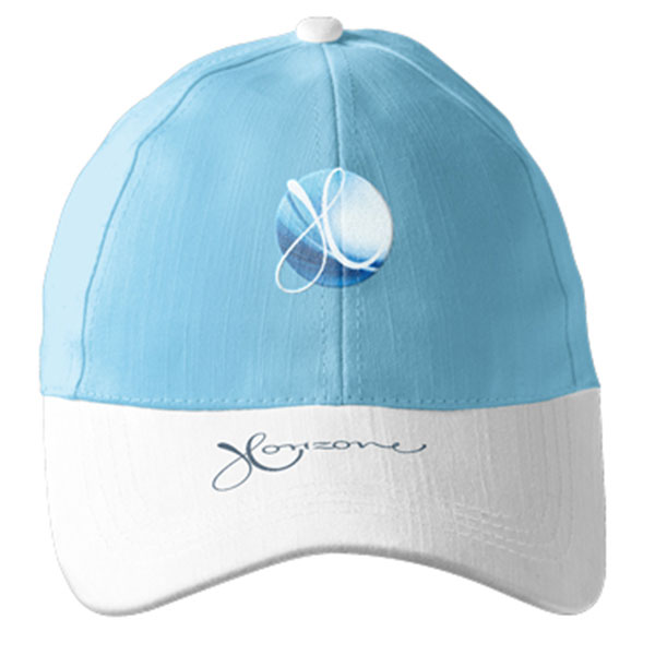
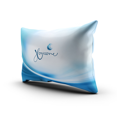
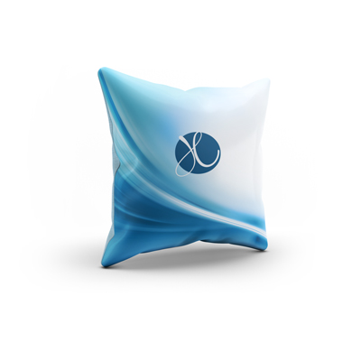
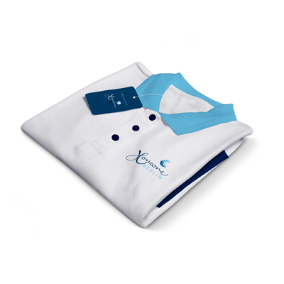
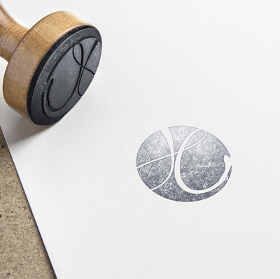
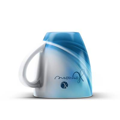
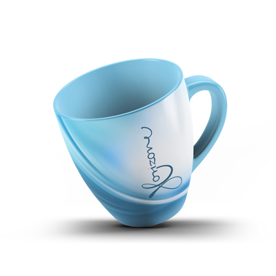
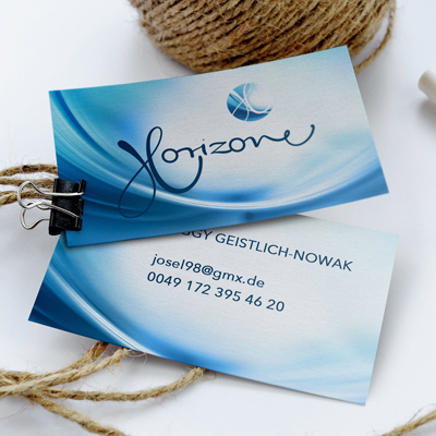
A couple from Berlin made their wish come true and purchased a Leopard 45 catamaran together with a friend. Their goal is to sail the Indian Ocean.
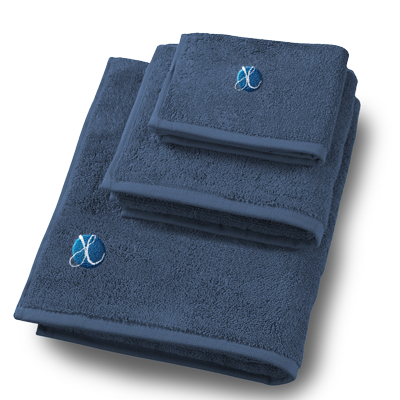
It was a real pleasure to work with Peggy, representing the owners. I am glad that HORIZONE is not a stand alone project but the beginning of something special. Soon we will start to design the branding of a new marina in the Seychelles, carrying almost the same name. I am looking forward to start with the project HORIZON, CHEZ SAILORS OF PRASLIN.


SEY SAILORS
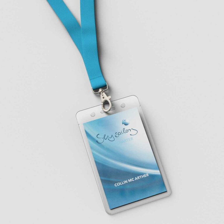
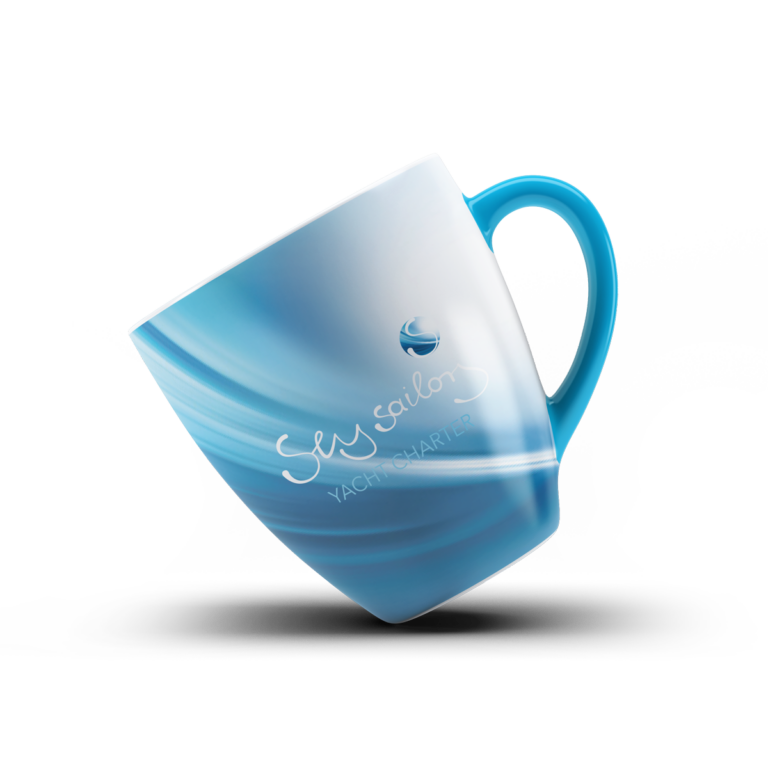
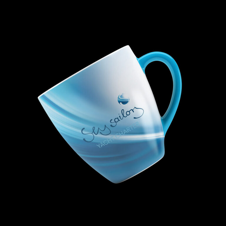
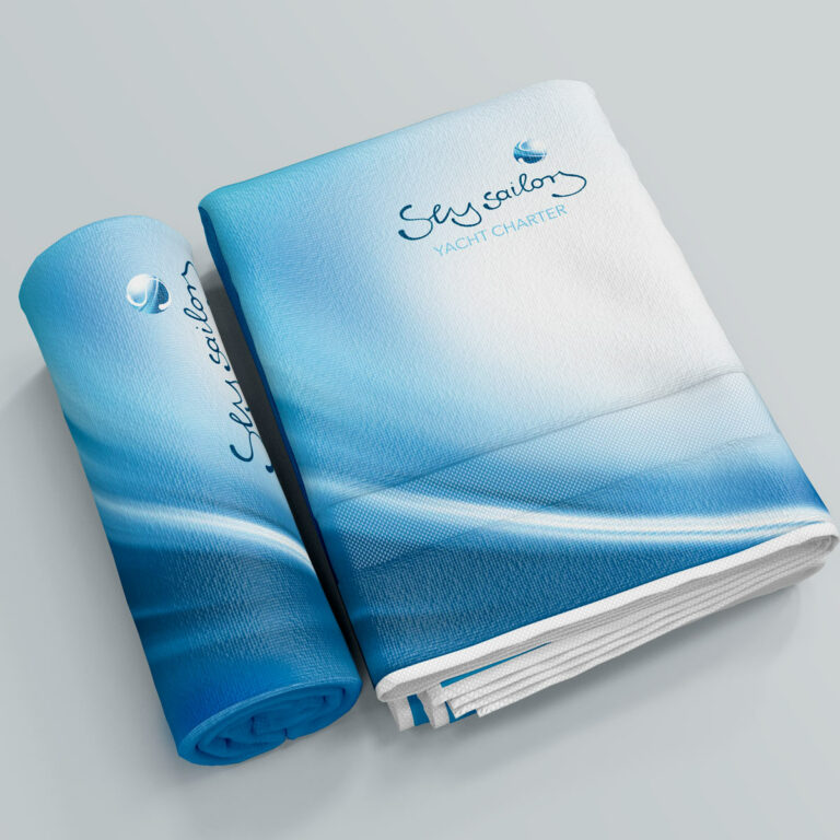
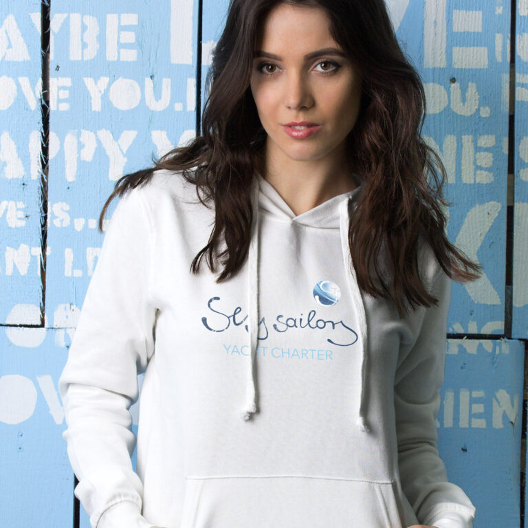
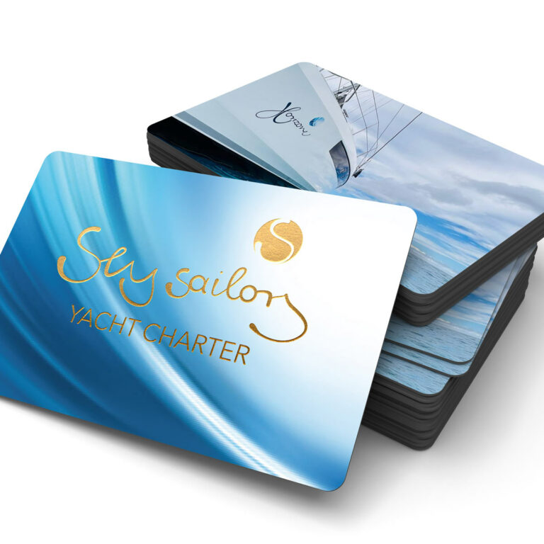
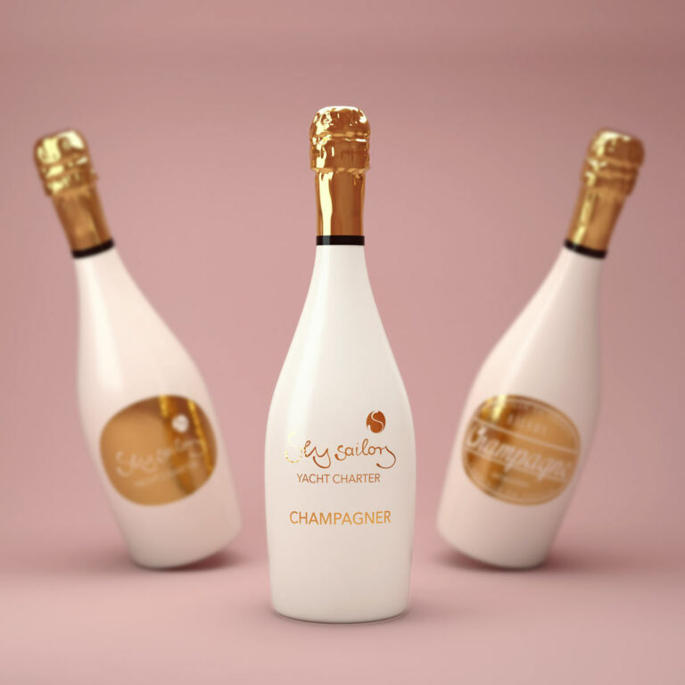
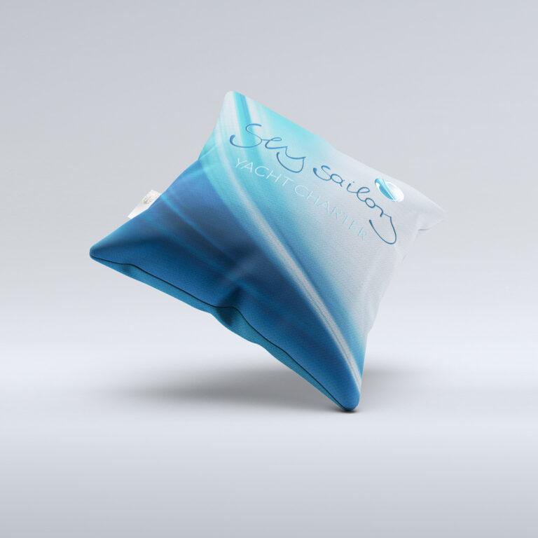
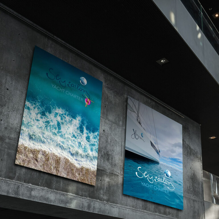
In accordance with the logo and branding of HORIZONE, a logo should be developed for the charter company of HORIZONE. Since the charter company is primarily based in the Seychelles and charters luxury boats there, the location is reflected in the name. „SEY,“ as the locals say, represents the Seychelles. I have utilized the background already established for Horizone for SeySailors as well. I have also adapted the hand-drawn, flowing font. Wishing all charter guests a lot of fun.


NALA
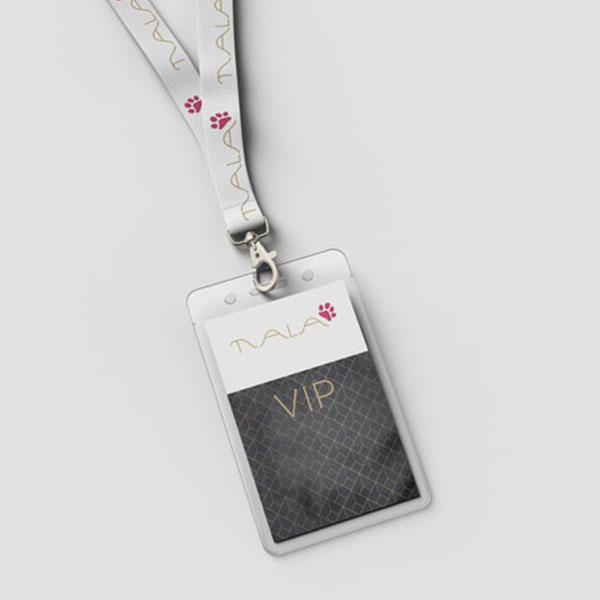
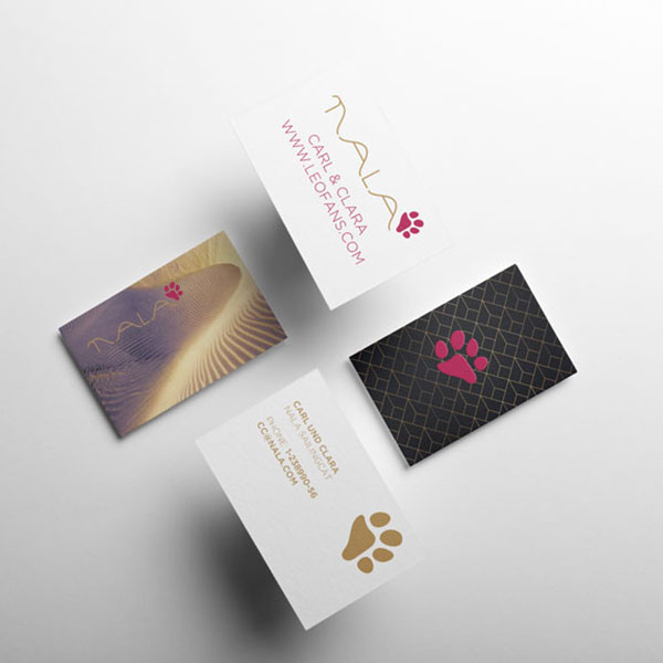
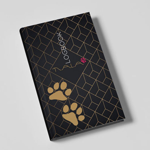
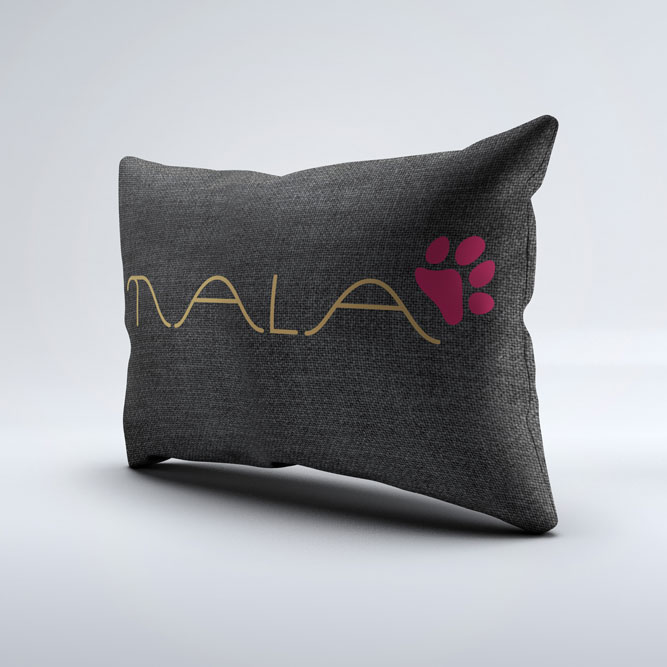
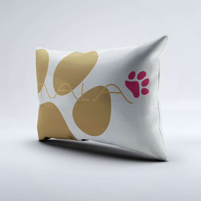
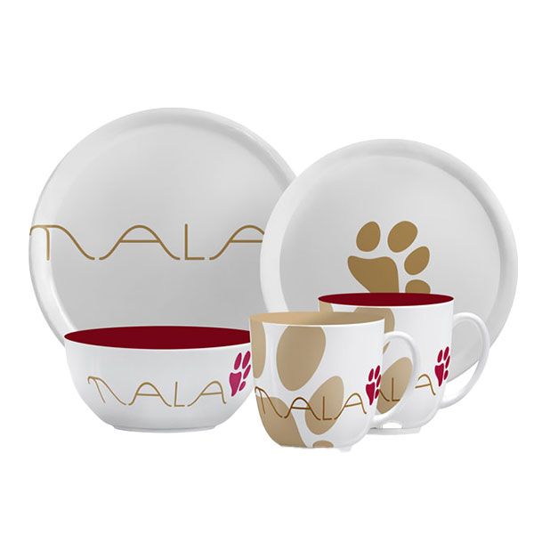
Nala is a Leopard Catamaran for a young couple.
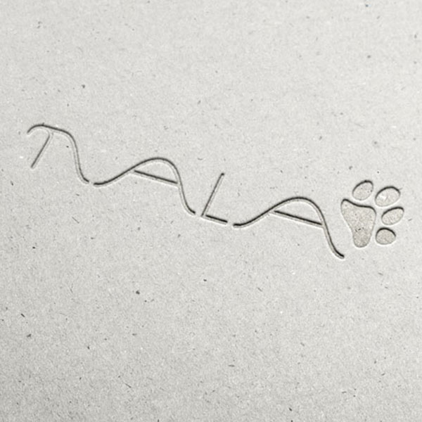
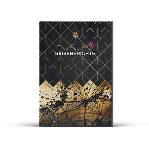
The name Nala comes from a character of Lion King and fits perfect to the vessel. The owners asked me to integrate the original Leopard icon, what is a footprint of a Leopard.
The colors are warm and give a good and welcoming feeling. Sand and dark red can be changed. Sometimes the type is red and the footprint in sand, sometimes its the reverse way.
SONORA
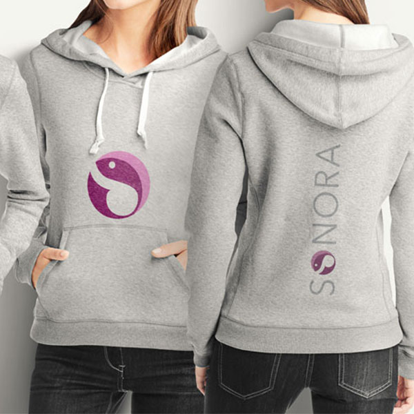
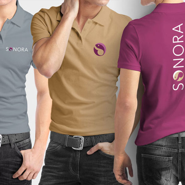
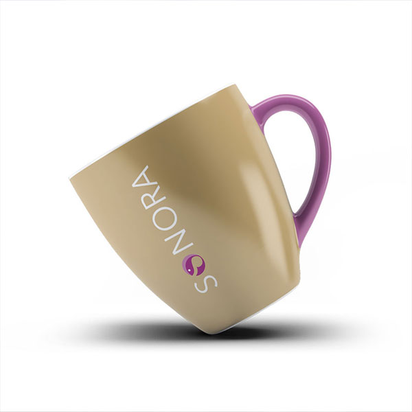
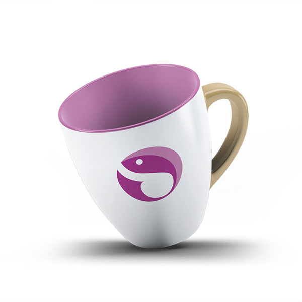
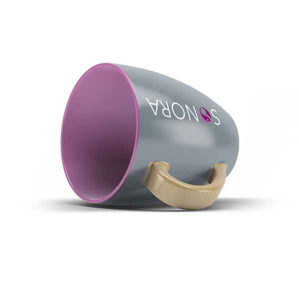
Sonora is a 50 feet Leopard Catamaran for a private owner. It will be used by a family of 4. With 2 kids. Bevor I started with my design work, I’ve collected the ideas and wishes from the hole family. And I was asked to make a design with an octopus or a fish.
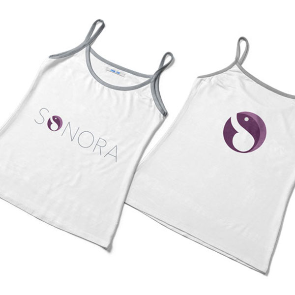
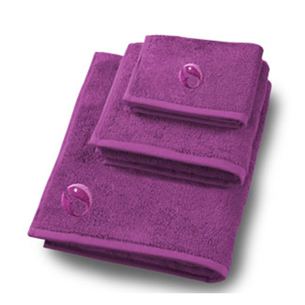
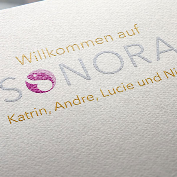
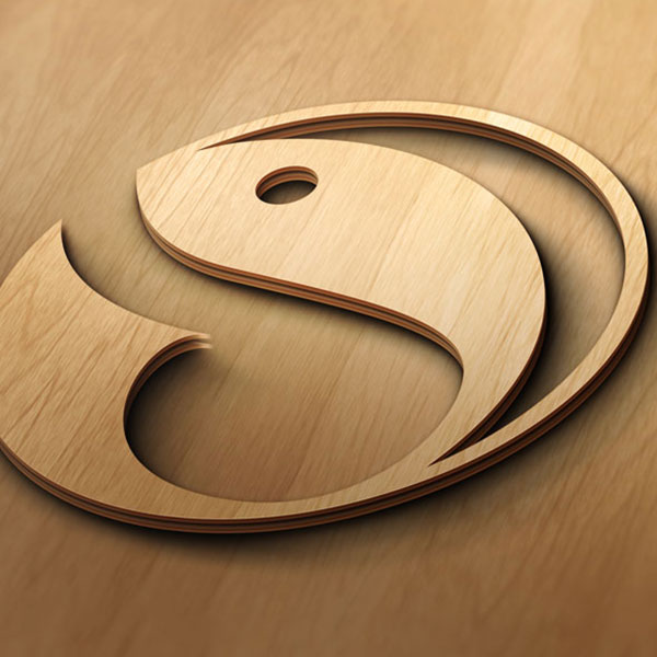
We left the octopus idea behind and I designed a solid and light looking Logo design. The type is based on a common typeface. The Logo is designed in 3 colors and an additional color for backgrounds and materials.

SAMEERA
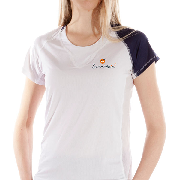
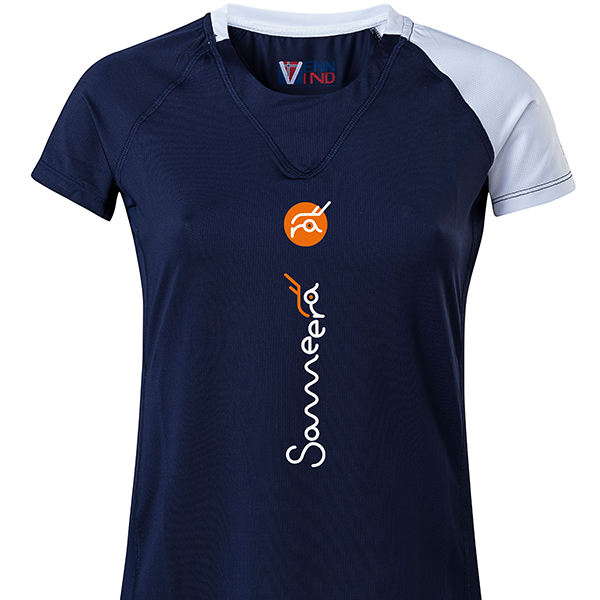
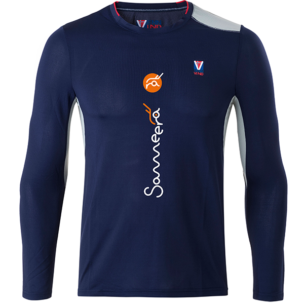
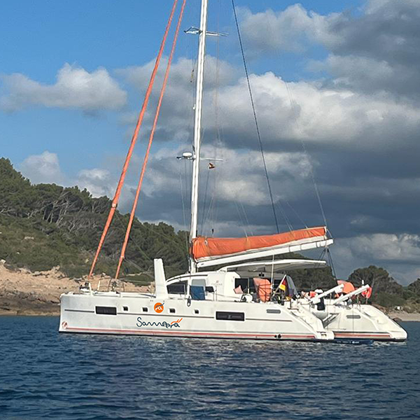
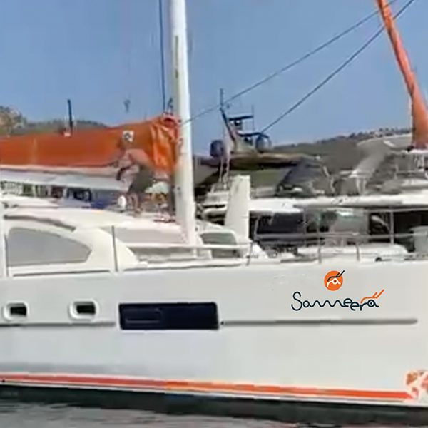
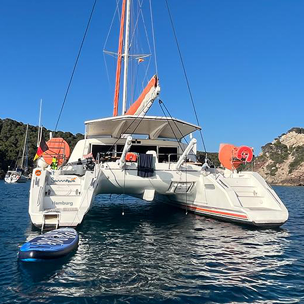
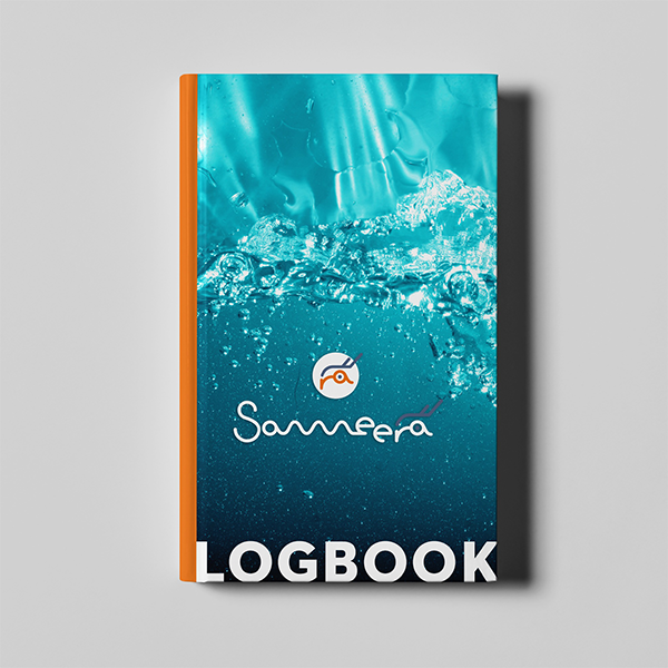
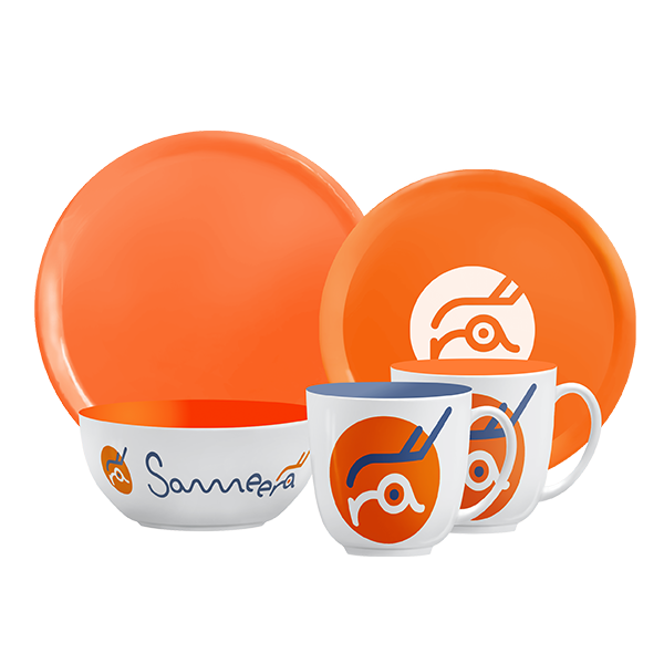
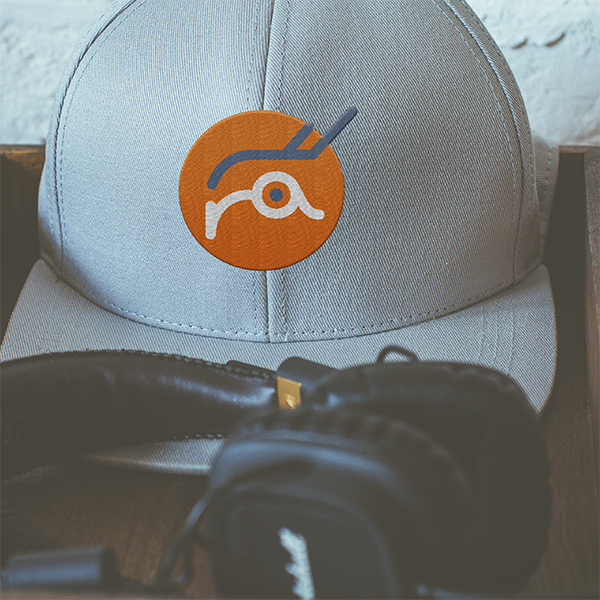
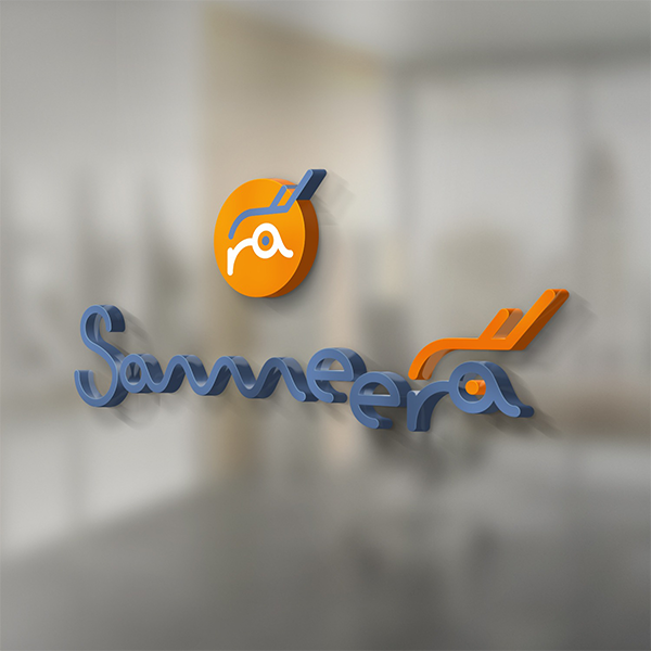
Designing a logo for a family of five is very special. The previous boat also had the name Sameera, a goddess of the winds. Now the Catana 50 should get this name. The colors were primarily based on the existing interior design with lots of orange and dark blue. The creation of the “Rabirds” RA is based on the idea of combining the two initial letters of the owners and creating an icon.

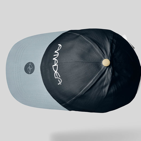
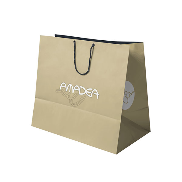
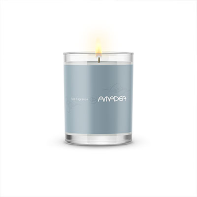
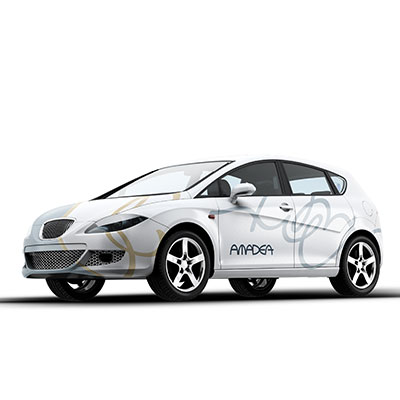
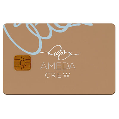
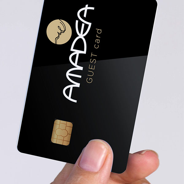
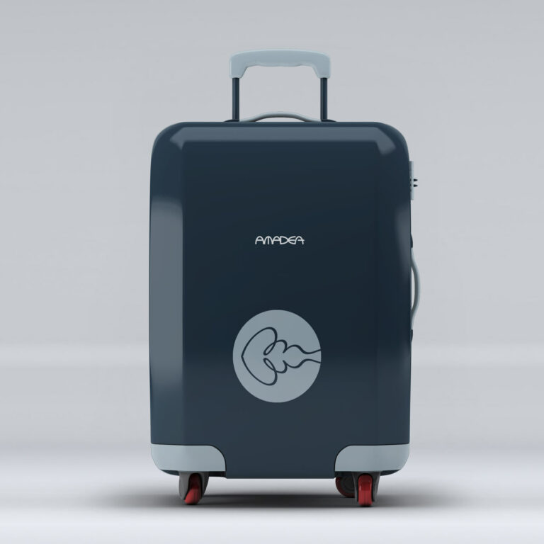
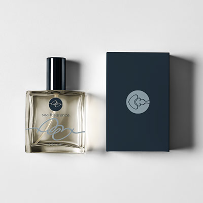
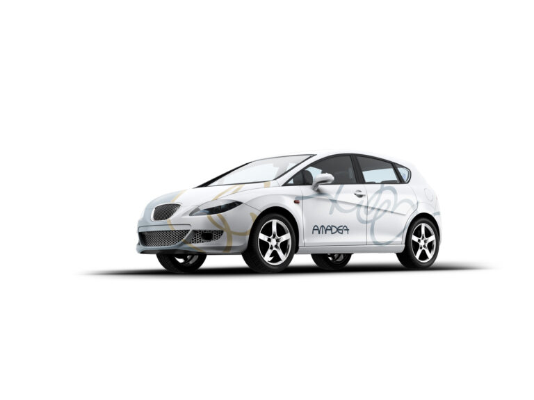
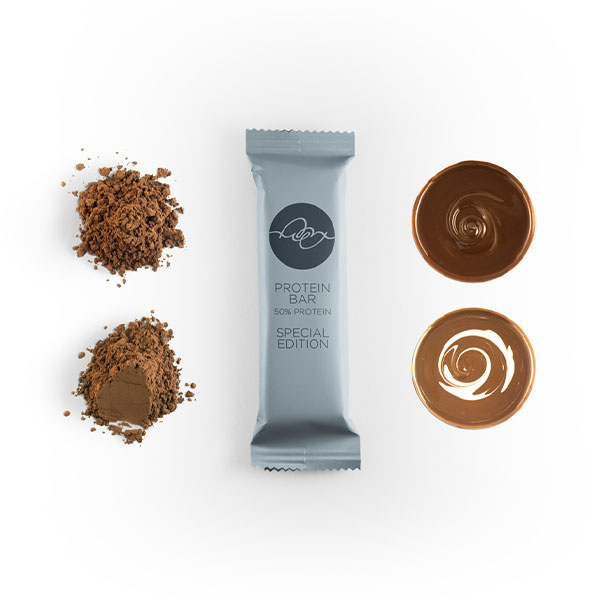
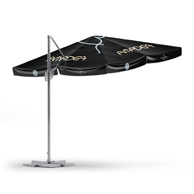
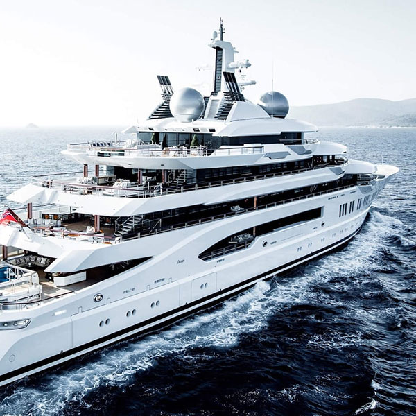
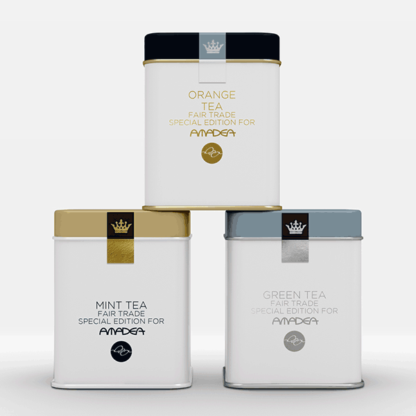
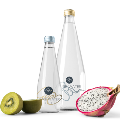
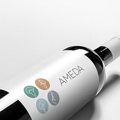
AMEDA and AMADEA
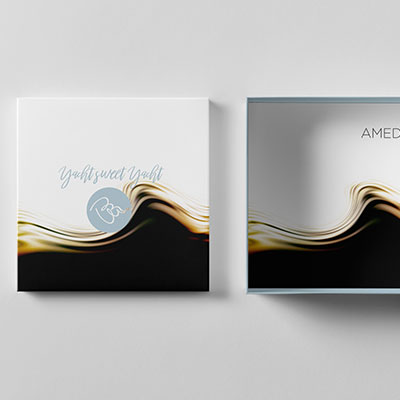
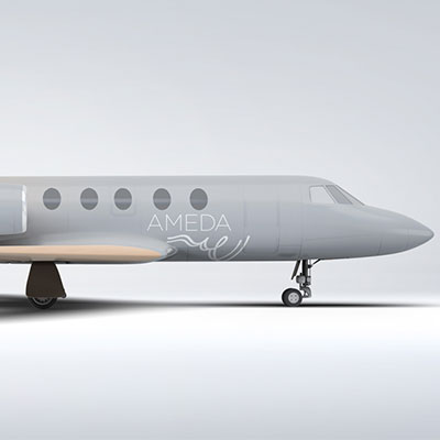
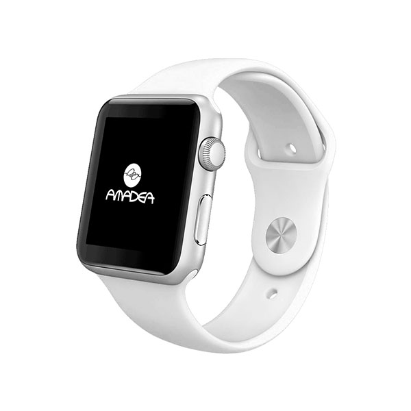
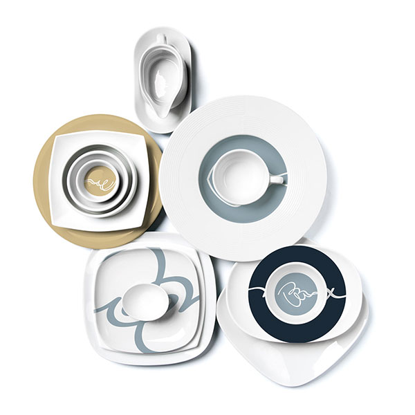
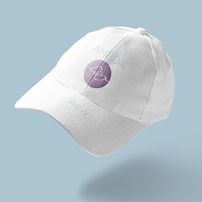
Creating a design and yacht branding for a 106 m vessel meets the challenge that it has to fit to very different applications and items. You will find the logo on deck as well as on every media, item, equipment and gift. It might get boring if used stoic. That’s why I have created a vivid design. That means depending from the application it may look slightly different without loosing the context. As long as the recipient recalls the logo, it creates a great recognition and positive modern approach – that’s exactly what a vivid design has to achieve.



GOOD VIPES
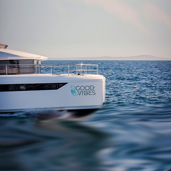
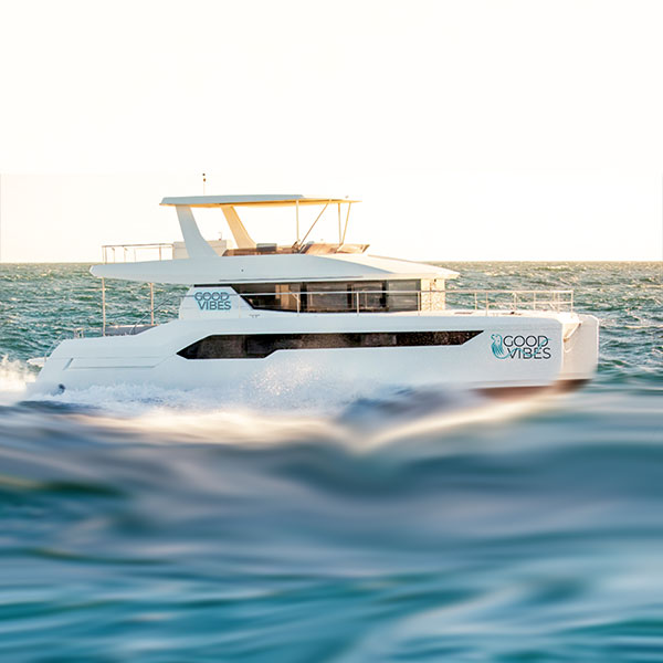
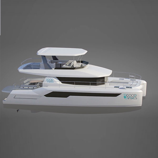
Good Vipes is more than a Vessel. It’s a project. The owner made clear, that he expected from everybody the absolutely best. The Leopard Motor Cat 53 has everything. A lot of solars, a generator, a great dinghy, a bose sound systems …
Logowise the owner couple have had a lot of ideas. Animals, Starfish’s, Wappen and heraltics. So I started with a lot of opportunity’s. Finally we decided, that an sea lion would fit best.
The logo can easily be used just as an icon or complet.
The typographical solution was a bold, clear font that is easy to see from a distance. Depending on the location, both the icon and the entire lettering with icon appear on the ship.
Good Vibes ist a Leopard 53 Powercat. When the owner couple asked me to design a logo, the name of the boat was not yet set. But they had quite a rough idea of the design. An animal had to included, the typography had to be clear and easy to read. Some green (actually very unusual on yachts) was required. We have turned green to petrol. And the animal, only an aquatic animal would work. There are quite enough logos with dolphins and whales, a jellyfish is not really likeable. So we found the sea lion graceful. In order ease the solid typography I used a wave to give the dynamics of the logo a kick.

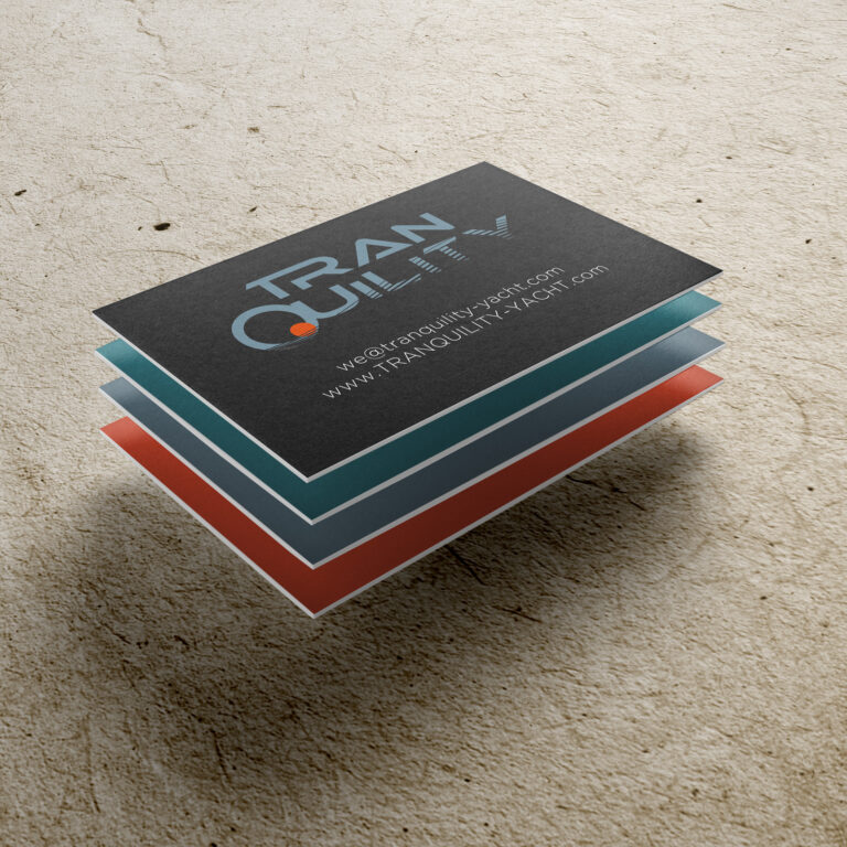
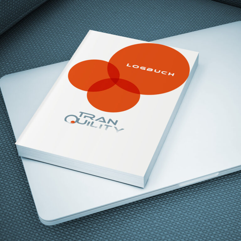
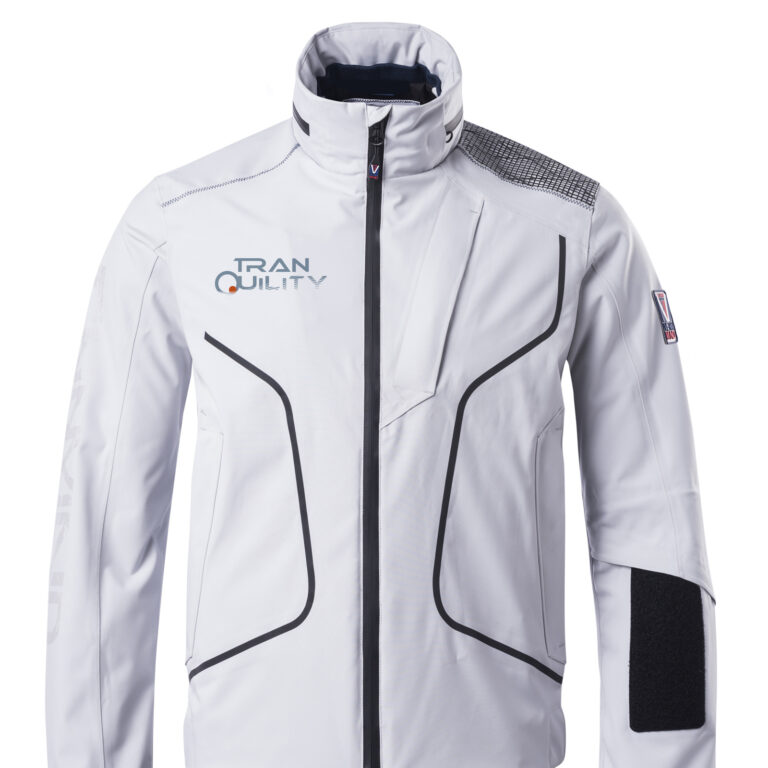
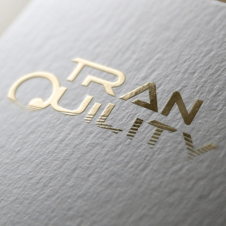
TRANQUILITY

AL SALAMAH
Creating a design for a Superyacht is a very special challenge. While I created the design, the yachtbuilders took care for the interior design.
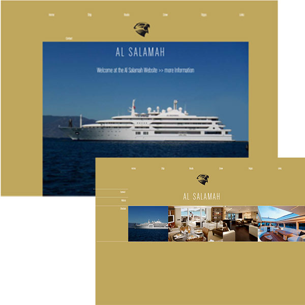
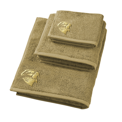
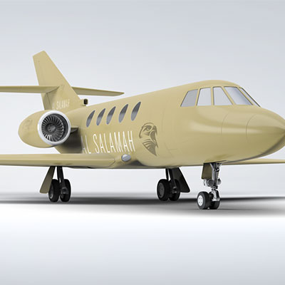
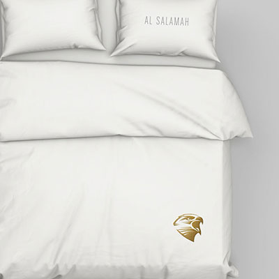
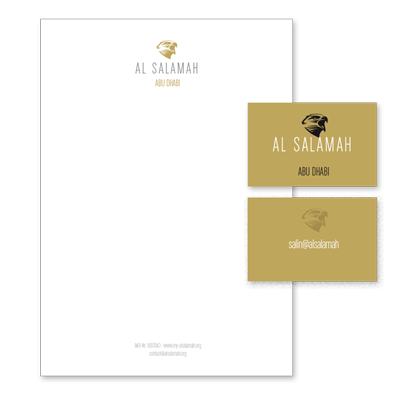
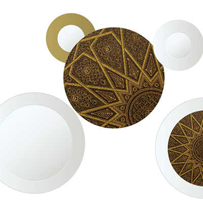
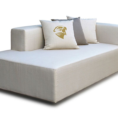
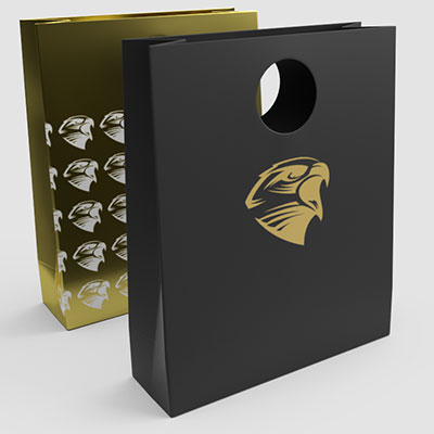
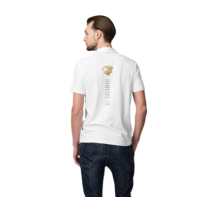
I defined the subject and the main colors. After taking the decision the equipment of the boat was defined. The required items were shirts and caps but also bed linen, towels, pillows, a cosmetic kit and even the jet design had follow the new design. The website seemed to be the least important. A Superyacht is not keep to attract fans or followers. It’s all about discretion. Therefore the site consists of only 3 visible areas, the ship, the route and a few selected videos. As it is still a work in progress only have to wait now until going live.
RIVERCAFE
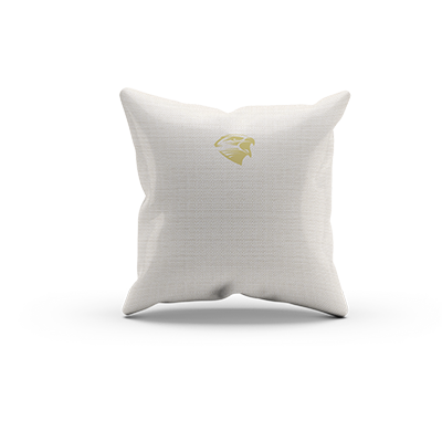
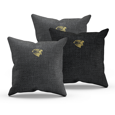
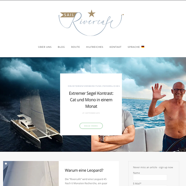
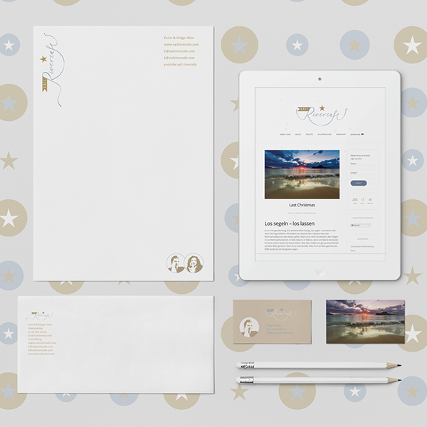
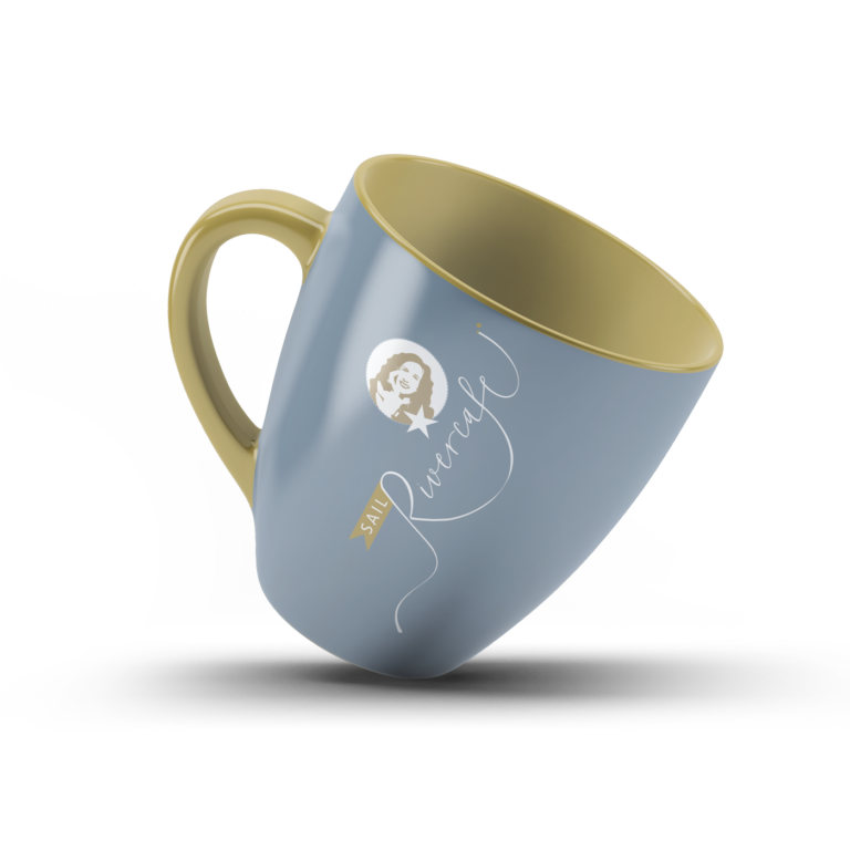
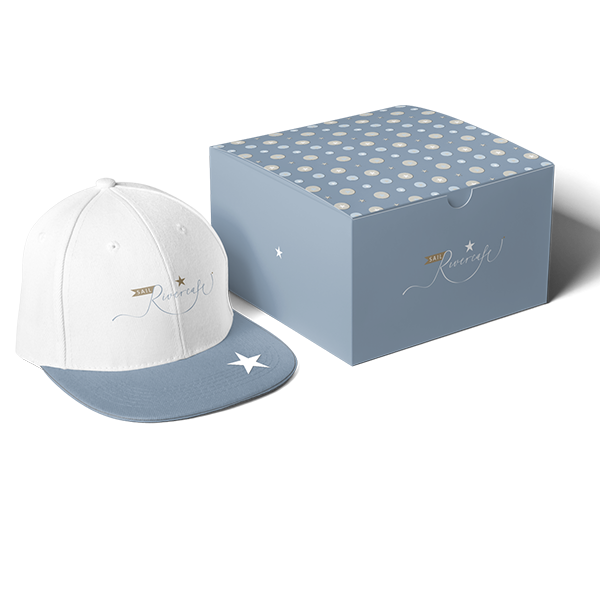
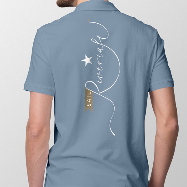
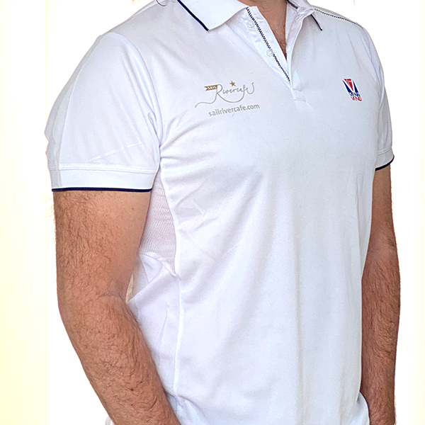
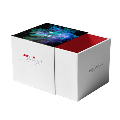
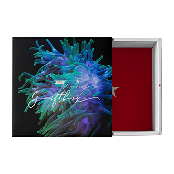
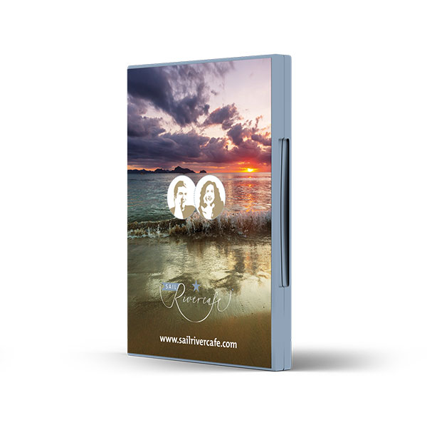
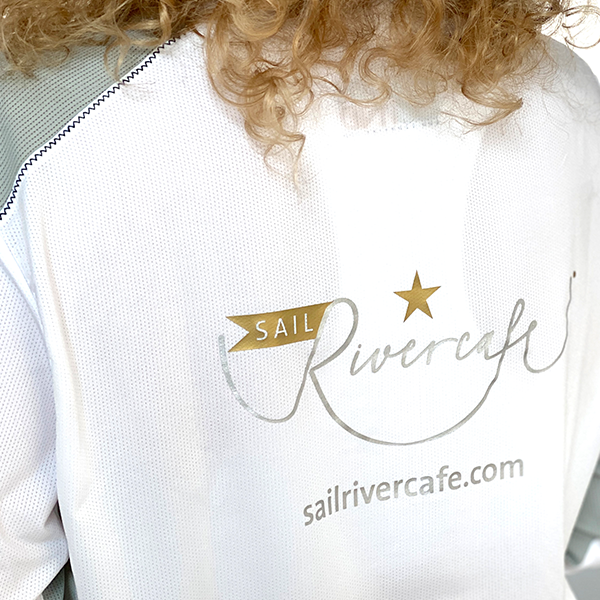
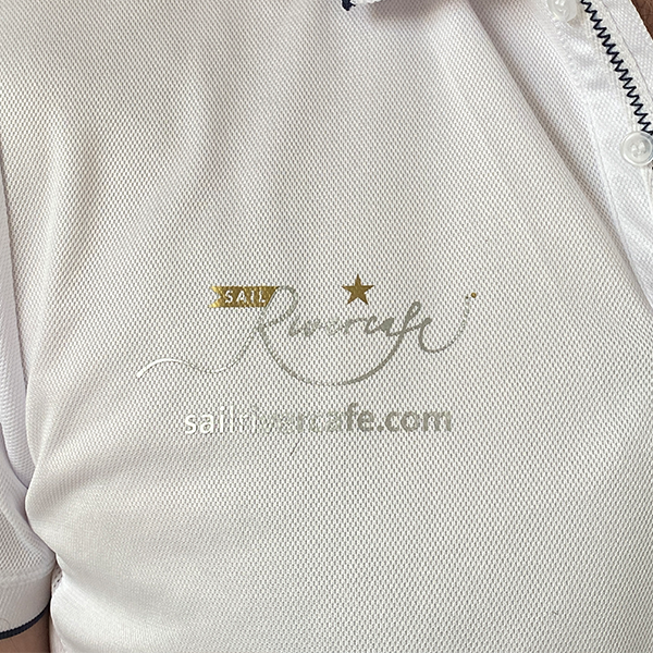
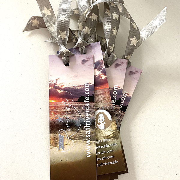
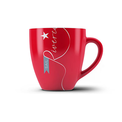
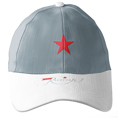
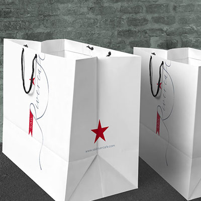
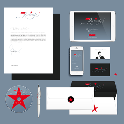
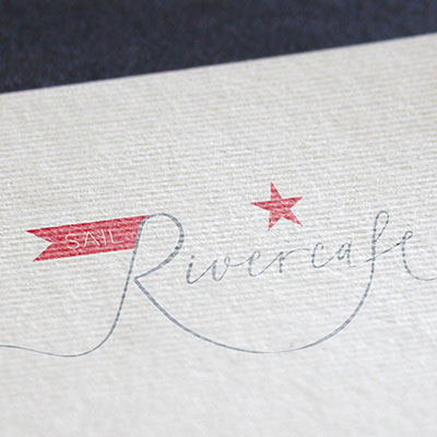
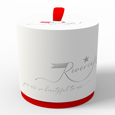
After designing 3 laogos drafts based on the same idea I have chosen this version for the Rivercafe, a sailing catamaran. The vessel was finished in mid 2020 and starts to a circumnavigation afterwards. I have designed different moodboards to figure out how the logo works.
Have a look for the final logo version and how it appears on different items for the sailing vessel RIVERCAFE. After the design in light grey and red was finished, I decided to change the colours in to silver and gold (light gray and sand). So i could show my clients how these particular colors work out.



NAUTILUS
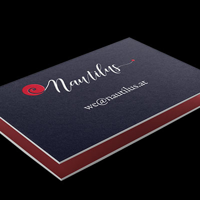
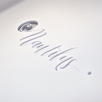
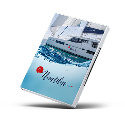
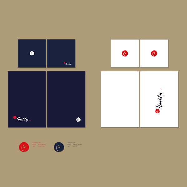
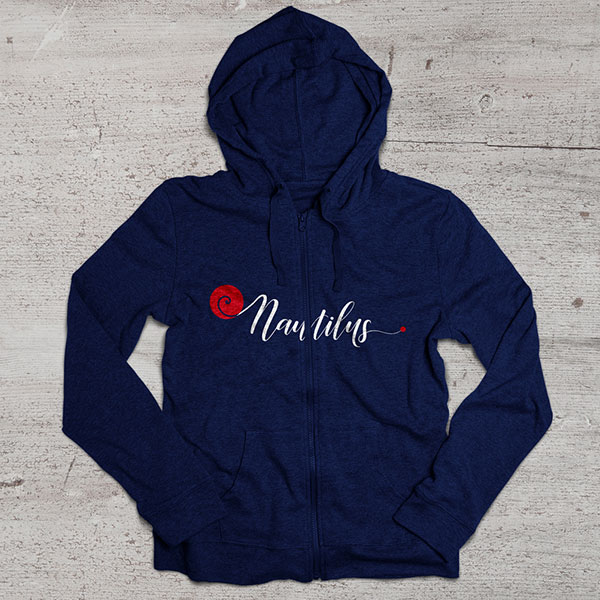
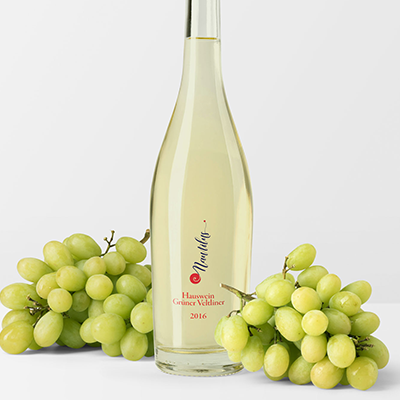
The Nautilus family is a very experienced sailing crew. The newly built Leopard 45 Cat should have the name Nautilus. I opt for an organic-looking typography and incorporate the Nautilus shell as a symbol. The hole family loves red and blue.

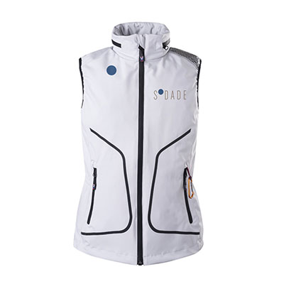
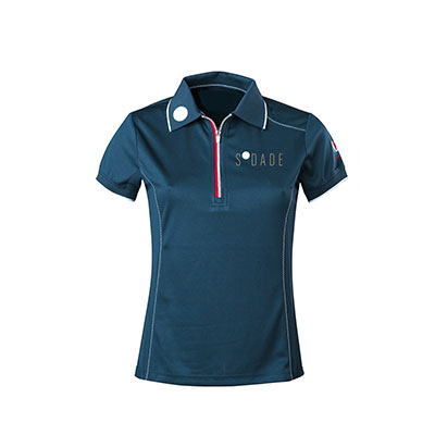
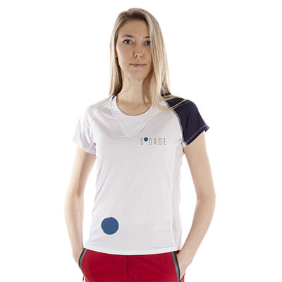
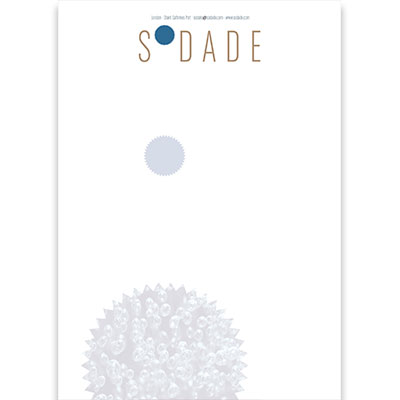
SODADE
ADALAN
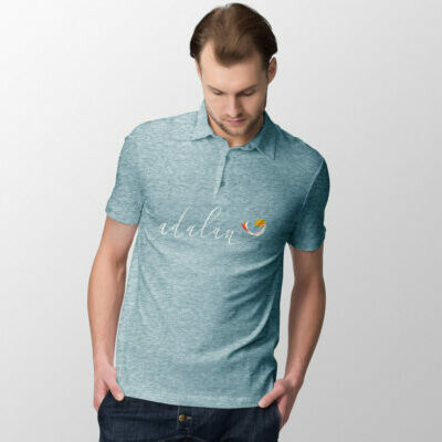
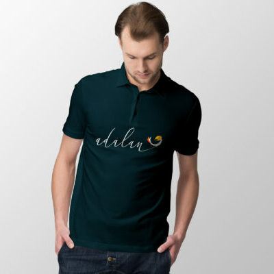
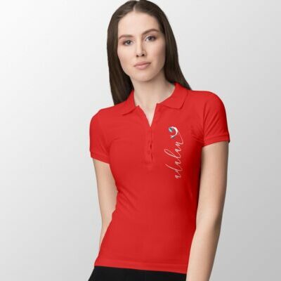
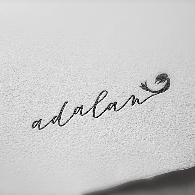
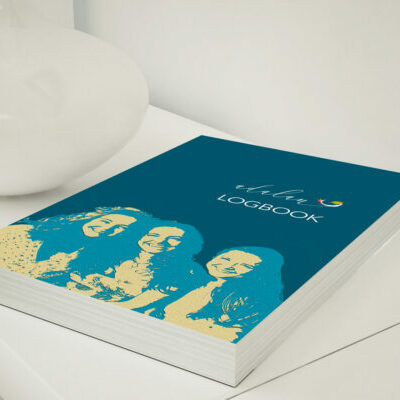
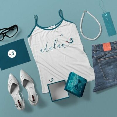
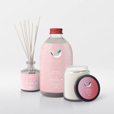
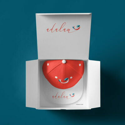
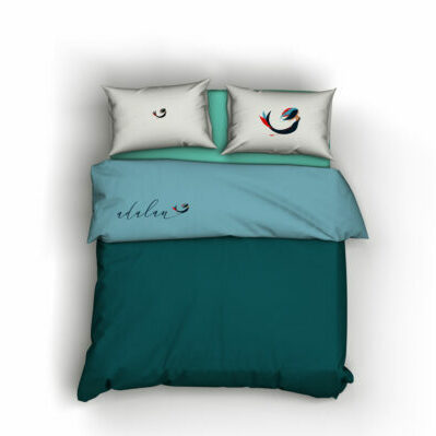
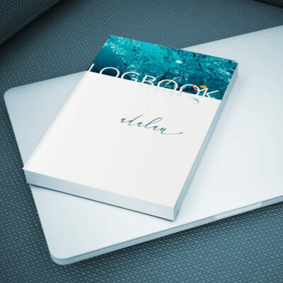
The „adalan“ is a brand new catamaran named after the three daughters of the owner, in the best Valsheda tradition. These young ladies are really beauties. The owner asked for a logo including mermaids. It should be curvy and flexible. The final result is two colored and it fulfills all the owner wishes.
