After many years as a creative in marketing, I’ve seen some amusing decisions when it comes to corporate or product colors. I still remember my astonishment when Dresdner Bank and Commerzbank merged and, of all colors, chose the Commerzbank’s impractical yellow. The application of it drove me to despair—money on white, „great contrast!“
My clients seem wiser in this regard. No one has ever wanted yellow. Orange and purple, yes, but at least those are visible on white.
The perfect color is usually found only after the form—the actual design — has been decided. Are there multiple elements? Are they connected? Does a logo element have a natural color (for example, a wave)? In my studio, we always finalize the shape first. That’s why we initially design all logos in black only. Only then do we move on to color selection.
I stopped asking, „What’s your favorite color?“ years ago. 63% of Northern Europeans say blue. Followed closely by green, then orange, and then red. But it would be damn boring if all logos differed only in shape.
Of course, you have to like the logo color. But above all, it has to work. Here are a few criteria:
You can forget anything that’s supposedly historically mandated. Neptune isn’t offended by green.
The most important thing is the background. Is the ship’s hull dark or light? Most newly built motor yachts are anthracite, while most sailboats are white. Our eyes perceive contrast first, then color. So I pay very close attention to contrast. If you’re working with multiple colors, one will likely have less contrast with the background. In that case, it should only be used as an accent color.
Fundamentally, it’s about light or dark. Once that decision is made, it’s advisable to distinguish between warm and cool tones.
Blue is a cool color, red is warm. With greens, it’s not so straightforward. A turquoise tone is cool, while a bright leaf green is rather warm.
White is also a color. Apple has proven that, and I was allowed to use white for a project as well. A grand choice, in my opinion.
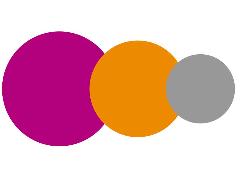
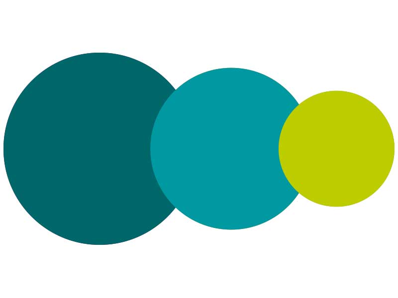
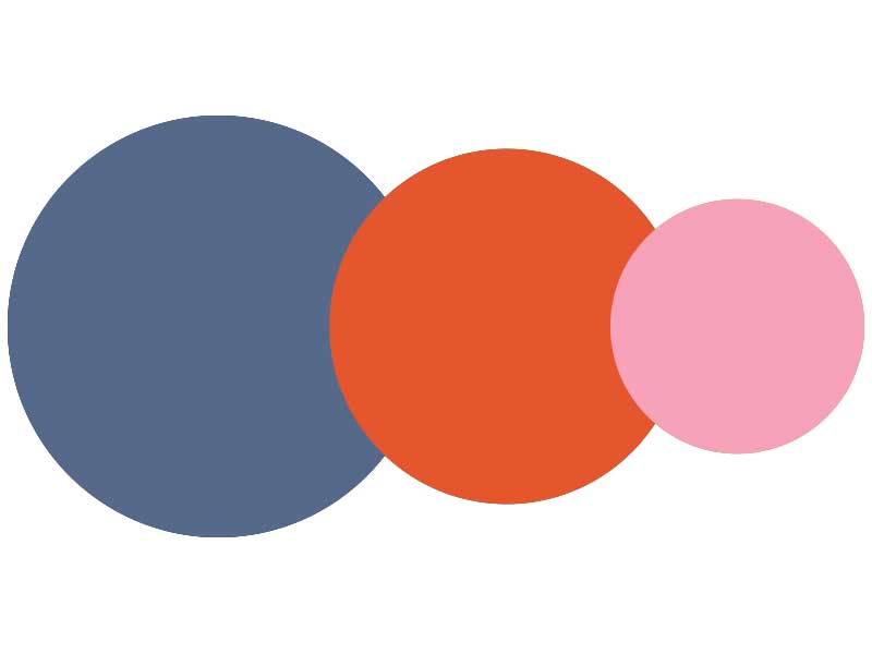
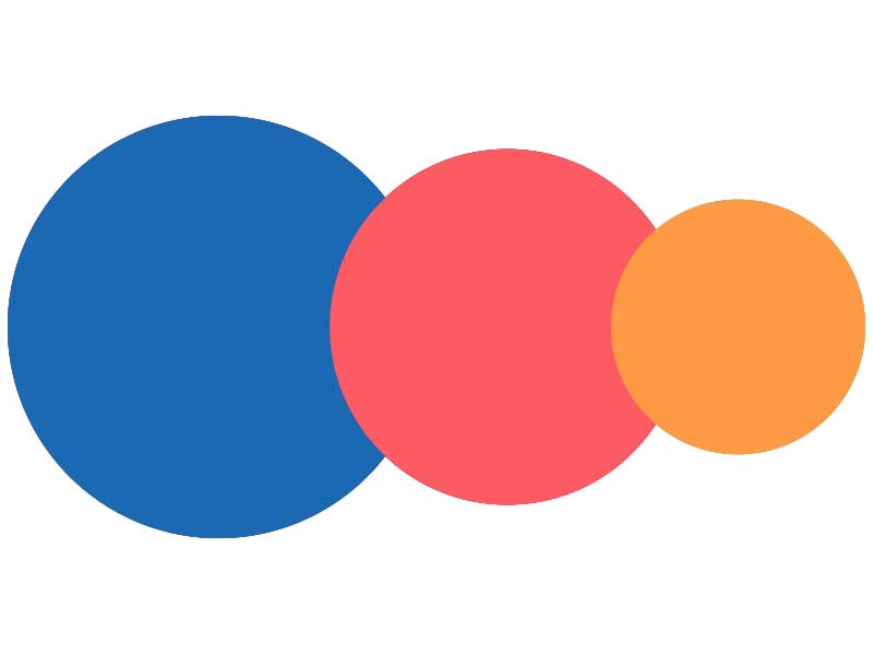
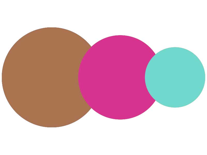
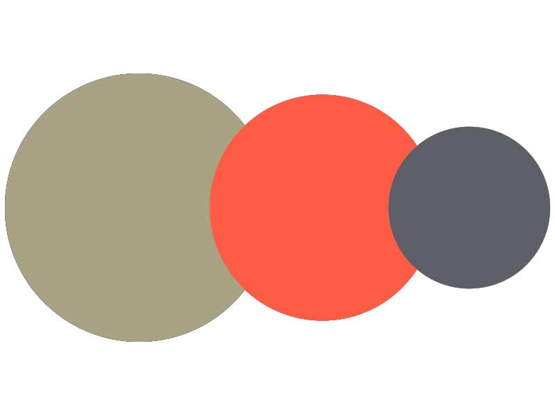
Unique colour combinations
Often, it’s helpful to draw inspiration from nature. Berry tones are dark enough on light backgrounds and unusual. Sand tones combine perfectly with turquoise or even lilac. Blue tones, while common, can provide perfect contrast. Brown only works in combination. Green, purple, and orange need less exciting neighbors, such as warm grays, beige, or rust tones.
In essence, there are few don’ts. Yellow really only works on dark backgrounds. Color trends rarely last more than a few years. Gray alone often looks dreary, and blue alone, as mentioned, is very common.
So, be bold with color.
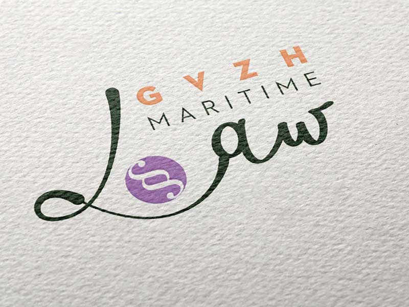
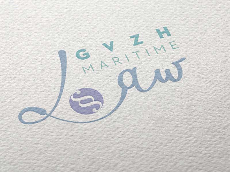
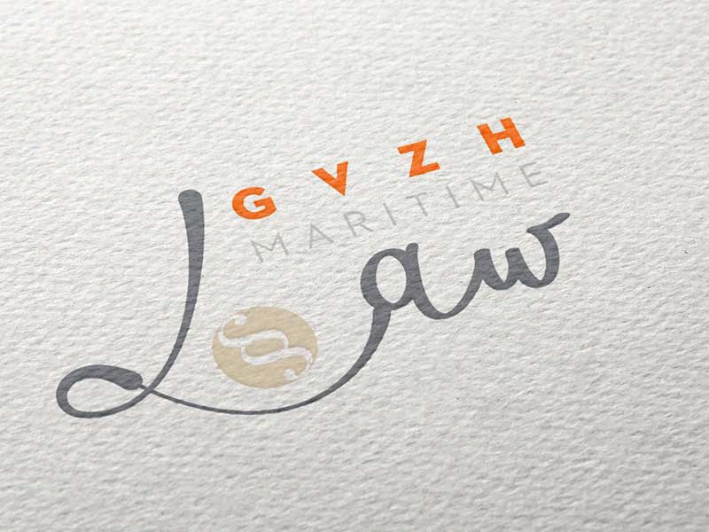
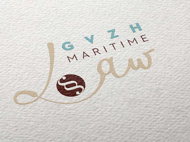
Colour test for a client
Colors primarily create a mood, emotions. This makes them a great starting point for choosing colors. If the focus isn’t on marketing or chartering, the color choice can be perfectly tailored to the owner. Are you more of a subtle type, or extroverted? Are you primarily creative, solid, thoughtful…? All of this can be easily expressed through colors. Give it a try.