
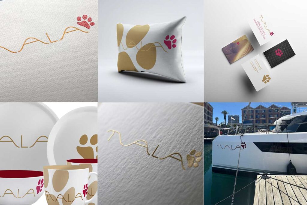
A yacht logo may look like a small detail.
Until you start using it.
Then it suddenly appears everywhere: on the hull, the stern, the tender, crew shirts, caps, towels, cushions, porcelain, business cards, websites and sometimes even on the smallest accessories on board.
And this is exactly where the difference between a name and a real yacht identity becomes obvious.
A well-designed yacht logo does much more than identify a vessel. It creates a visual language that can make everything around the yacht feel more personal, more coherent and, quite simply, better.
A yacht deserves more than just its name
Many yachts begin with a name written in a nice typeface. There is nothing wrong with that. A beautiful typographic logo can be the right solution for a particular yacht.
But sometimes a word alone doesn’t give you enough flexibility.
An iconic element can change everything.
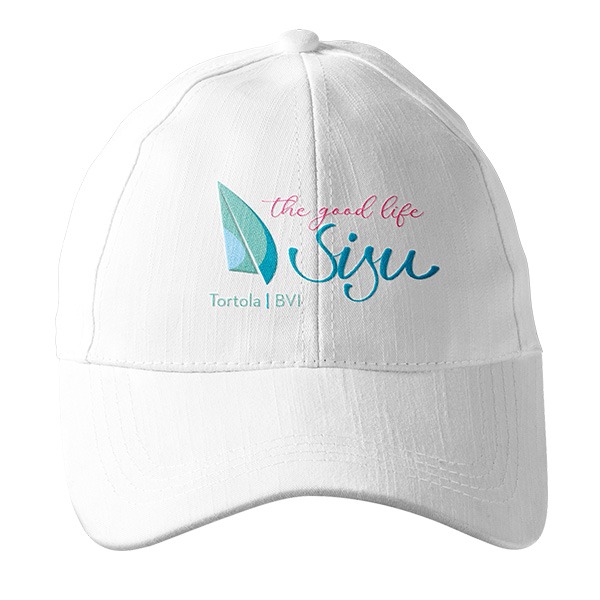
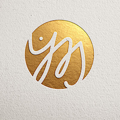
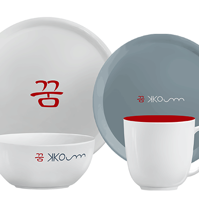
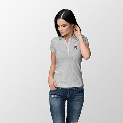
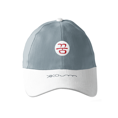
Think about a cap. A small embroidered icon can look elegant and recognisable from a distance, whereas a long yacht name may become difficult to read. The same applies to a polo shirt, a crew jacket, a towel or a piece of porcelain.
A good logo gives you options: the complete logo can be used where there is enough space, while the icon can stand alone where there isn’t.
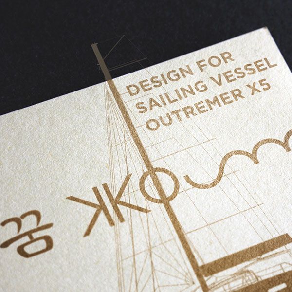
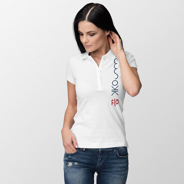
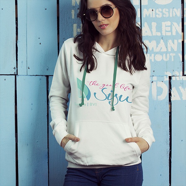
This kind of flexibility is one of the most valuable qualities a yacht logo can have. It is also something that becomes particularly apparent when the branding moves from the yacht itself to its equipment and crew wear. MYL projects such as KKOUM and SiSu demonstrate how an icon and typography can work together or independently, depending on the application.



The icon becomes a signature
There is something special about a symbol.
A name has to be read. An icon can simply be recognised.
Over time, a well-designed symbol can become almost like a signature for the yacht. You may see it on a cap across a marina and recognise the vessel before you have even seen the name.
This is especially useful for short-term visual encounters: another yacht passing by, a tender approaching a dock, a crew member walking through a harbour, or a photograph where the yacht name itself isn’t clearly visible.
The icon doesn’t have to be complicated. In fact, the strongest symbols are often surprisingly simple.
But simplicity is not the same as generic design.
A good icon needs an idea behind it.

Individuality matters
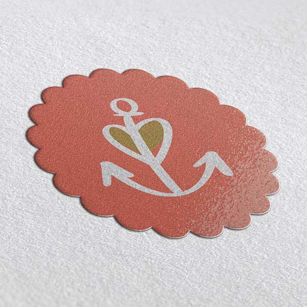
There are thousands of yachts. There are also thousands of anchors, waves, dolphins, compasses and nautical crests.
Using a familiar maritime symbol isn’t necessarily wrong. The challenge is to make it yours.
The best yacht logos are connected to something individual: the owner’s personality, the history behind the name, the yacht itself, a family story, a place, a particular attitude or simply an aesthetic that feels unmistakably right.
For example, a logo might hide initials within a symbol, interpret the meaning of a name, combine two cultural references or transform a personal idea into something abstract.
That is where professional logo design becomes more than decoration.
It is about finding the one visual idea that belongs to this yacht — and not to the yacht next door.
Good design is also good craftsmanship
A logo can look impressive at first glance and still be badly constructed.
Spacing can be wrong. Letters can feel unbalanced. Lines may be too fine. An icon may look beautiful at large size but fall apart when embroidered on a cap.
Professional logo design means thinking about these details.
Sometimes the smallest adjustment makes the biggest difference: the distance between two letters, the thickness of a line, the relationship between an icon and the name, or the way two shapes meet.
This is why a finished yacht logo should not simply be selected from a few attractive sketches. It needs to be refined.
A logo is a small piece of graphic engineering.
And like good engineering on a yacht, the quality is often found in the details.
One logo — many sizes
A yacht logo has a particularly demanding life.
- It might need to work several metres high on a hull and only a few centimetres wide on a cap.
- It might be printed, cut from vinyl, embroidered, engraved, painted, embossed or applied to fabric.
- It may appear in one colour, two colours or full colour.
This means that the logo needs to survive very different technical conditions. A well-designed identity therefore shouldn’t consist of just one JPG file. It should have appropriate versions and formats for different applications — for example, vector artwork for production, colour variations, monochrome versions, an icon-only version and layouts that work horizontally or vertically where necessary.
The original design should anticipate these applications rather than trying to solve them afterwards.
Mock-ups are not just decoration
There is a simple question every yacht logo should answer:
What will it actually look like on the yacht?
A logo that looks fantastic on a white computer screen may look completely different on a dark hull.
Scale changes perception.
A colour that works beautifully on paper may have insufficient contrast against the hull. A delicate detail may disappear when viewed from a distance. A logo may look perfect on the bow but feel too large on the stern.
This is why realistic simulations and mock-ups are such an important part of the design process.
They allow the owner to see the logo in its real environment before production begins.
MYL’s projects show this approach repeatedly: designs are considered on hulls, sterns, clothing and other objects rather than being treated as isolated graphics.
A good mock-up isn’t there to make a presentation look pretty.
It is a design test.
Colour is part of the identity
Choosing the colour shouldn’t simply start with, „What’s your favourite colour?“
The hull comes first.
A logo has to create sufficient contrast against its background, while the colours also need to work with the character of the yacht and its surroundings. Light and dark, warm and cool, subtle and expressive — all of these decisions influence how the identity feels.
And colour needs to work across applications.
The shade that looks beautiful on a screen may need to be adjusted for vinyl, embroidery, fabric or print.
That is why colour should be considered as part of the complete system rather than as an afterthought. MYL’s approach of developing the form first and testing colour against actual backgrounds is a good example of this.

The logo should work without shouting
Luxury does not necessarily mean complicated. For yachts in particular, restraint can be extremely powerful.
A thin, elegant line can look sophisticated on a hull. A subtle symbol can feel more exclusive than an oversized graphic. A carefully constructed typographic logo can say much more than a collection of decorative elements.
At the same time, minimal should never mean generic. There is an important difference between simple and unfinished.
A successful minimal logo still has character, proportion and an idea behind it. The current
It creates consistency on board
Once the logo has been designed properly, it can become the thread that connects the entire yacht.
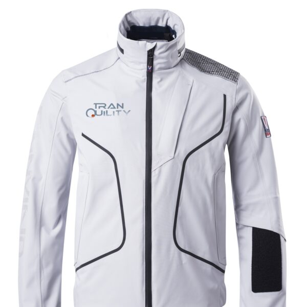
- Crew uniforms.
- Caps.
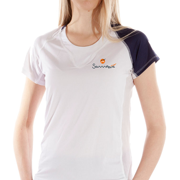
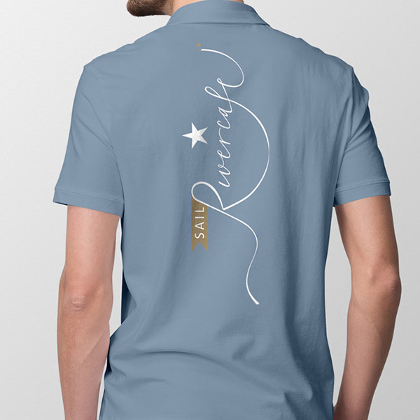
- Polo shirts.
- Towels.
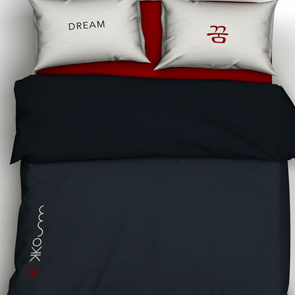
- Bed linen.
- Cushions.
- Porcelain.
- Cosmetic products.
- Tender equipment.
- Stationery.
- Gifts for guests.
- The website.
Even details that visitors may never consciously notice.
This consistency creates a feeling that everything belongs together.
One of the most striking examples is a large yacht where the identity has to function across everything from the deck and equipment to guest items. In one MYL project, the branding extended to shirts and caps, bed linen, towels, pillows, cosmetic kits and even the jet.
That is when a logo stops being a sticker on a boat and becomes a brand.
It makes crew wear feel like part of the yacht
Crew wear deserves particular attention.
A uniform is highly visible, and a logo can either make it look like generic workwear or like something that was deliberately designed for that yacht.
A strong icon embroidered on a cap or positioned discreetly on a shirt can look remarkably elegant.
And there is another advantage: crew members become part of the visual identity without the branding having to be loud.
The same principle applies to guest accessories. A beautifully designed logo on a towel, water bottle or piece of porcelain can turn an ordinary object into something that feels unique to the yacht.

It tells a story without explaining it
The best logos often contain a story that isn’t immediately obvious.
- A symbol might represent a family.
- A letter might be hidden inside an image.
- A shape might refer to the origin of the yacht’s name.
- A colour might come from the interior.
- A visual element might connect the owner’s heritage with the destination where the yacht will spend most of its time.
The important thing is that the story doesn’t have to be explained every time.
It simply gives the logo depth.
And that depth is one of the things that separates a bespoke yacht identity from a template.
A good logo grows with the yacht
Yachts change.
Owners change. Interiors are refitted. Equipment changes. A private yacht may become a charter yacht. A sailing project may eventually become a business.
A flexible identity can adapt.
The logo may need to appear more formally in one context and more playfully in another. It might need a complete version, an icon, a monochrome version or a simplified application.
This doesn’t mean constantly redesigning the logo.
Quite the opposite.
It means creating an identity that has enough flexibility from the beginning.
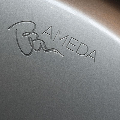
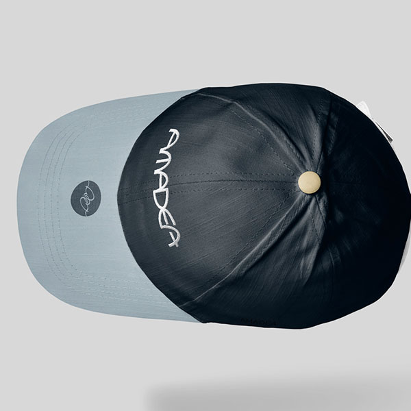
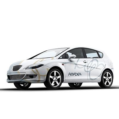
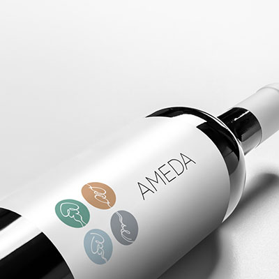
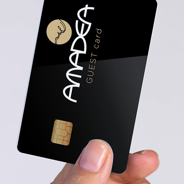
MYL’s work on the sisterships AMEDA and AMADEA, for example, describes a deliberately more vivid identity that can vary slightly according to the application while retaining recognition and consistency.

The real value is in everything that happens afterwards
Perhaps the most important reason to invest in a good yacht logo is this:
You don’t buy the logo once. You use it hundreds of times.
Every cap, shirt, towel, photograph. Every arrival in a marina. Every invitation, piece of equipment, detail a guest touches.
The better the original identity, the better all of these things can look.
A well-designed logo therefore isn’t simply an expense for a new yacht. It is the foundation for everything that follows.
- It gives the yacht individuality.
- It creates recognition.
- It makes merchandise and crew wear look considered.
- It provides flexibility across materials and sizes.
- It helps different elements on board feel connected.
And, perhaps most importantly, it gives the yacht something that cannot be bought off the shelf:
its own visual character.
A yacht is already unique in many ways.
The logo should make that uniqueness visible.
© 2026 MYL – All Rights Reserved.
This article is protected by copyright. No reproduction, redistribution, commercial use or publication of this content, in whole or in part, is permitted without prior written permission from MYL.
Unauthorised copying, reproduction or commercial exploitation of this content is prohibited.